GreenDot Labs Cannabis Illustrations
I had the pleasure to illustrate these wonderfully weird fruits and meats for GreenDot Labs Cannabis! Pink Froot was an extension of an existing familial line, but the artwork was done by another artist so needed to remain consistent. Aside from the illustration style a green glow also unified them, so with a very specific client brief outlining the desire for grape eyeballs and stem tentacles I set to work. Additionally I illustrated an extension of the Blu Froot strain—Belgium Blu. As for the meat—I worked on a yummy slab of Otoro to match their existing Wagyu strain.
Read More ›
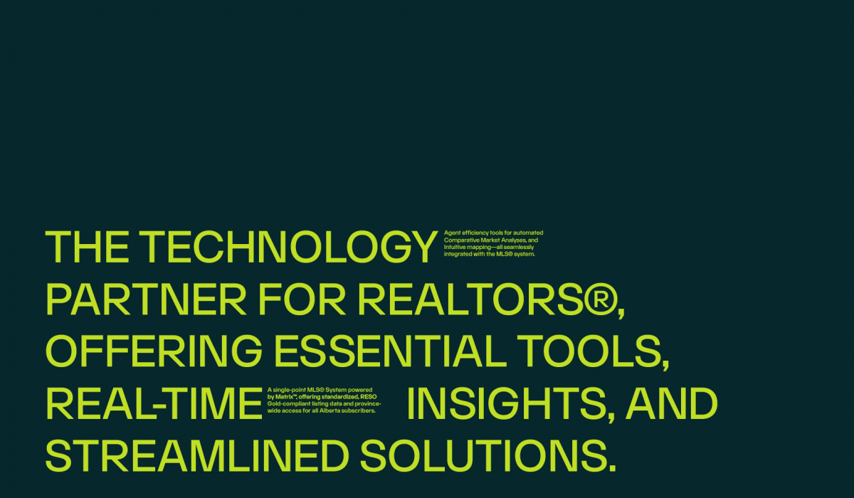
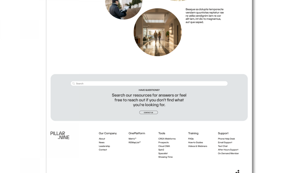
PILLAR9 REBRAND: B2B SAAS COMPANY
PILLAR9 is a B2B SaaS platform serving the Albertan real estate industry. All licensed REALTORS® in the province receive membership, granting them access to streamlined technology tools, such as OnePlatform: a user-friendly database that centralizes property listings and integrates essential business tools, along with comprehensive, province-wide listing data. Homeowners and buyers can also subscribe to enhance their selling/buying power. As Senior Designer at Redphone, I collaborated with the Creative Director and Art Director to concept a full rebrand for PILLAR9. Starting with mood boards and strategy sessions, we worked together to distill the brand’s purpose and message. This presentation showcases the visual direction that was pitched to the client.
Read More ›
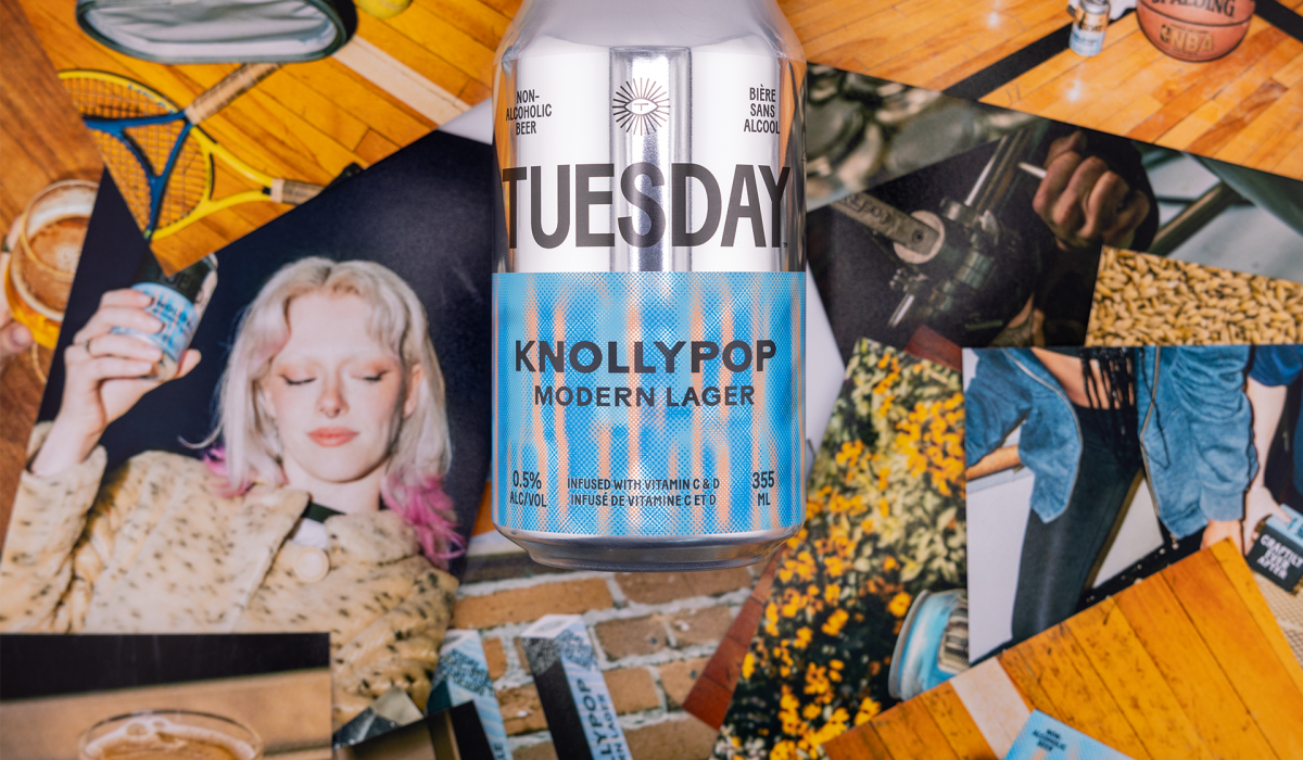
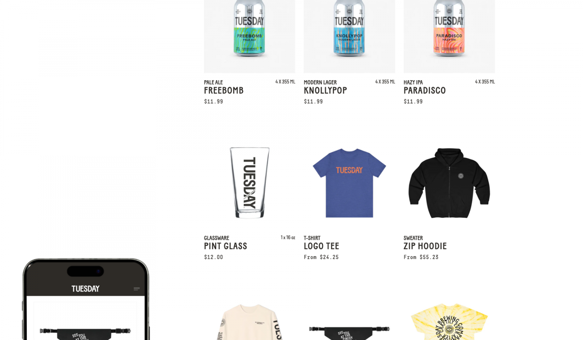
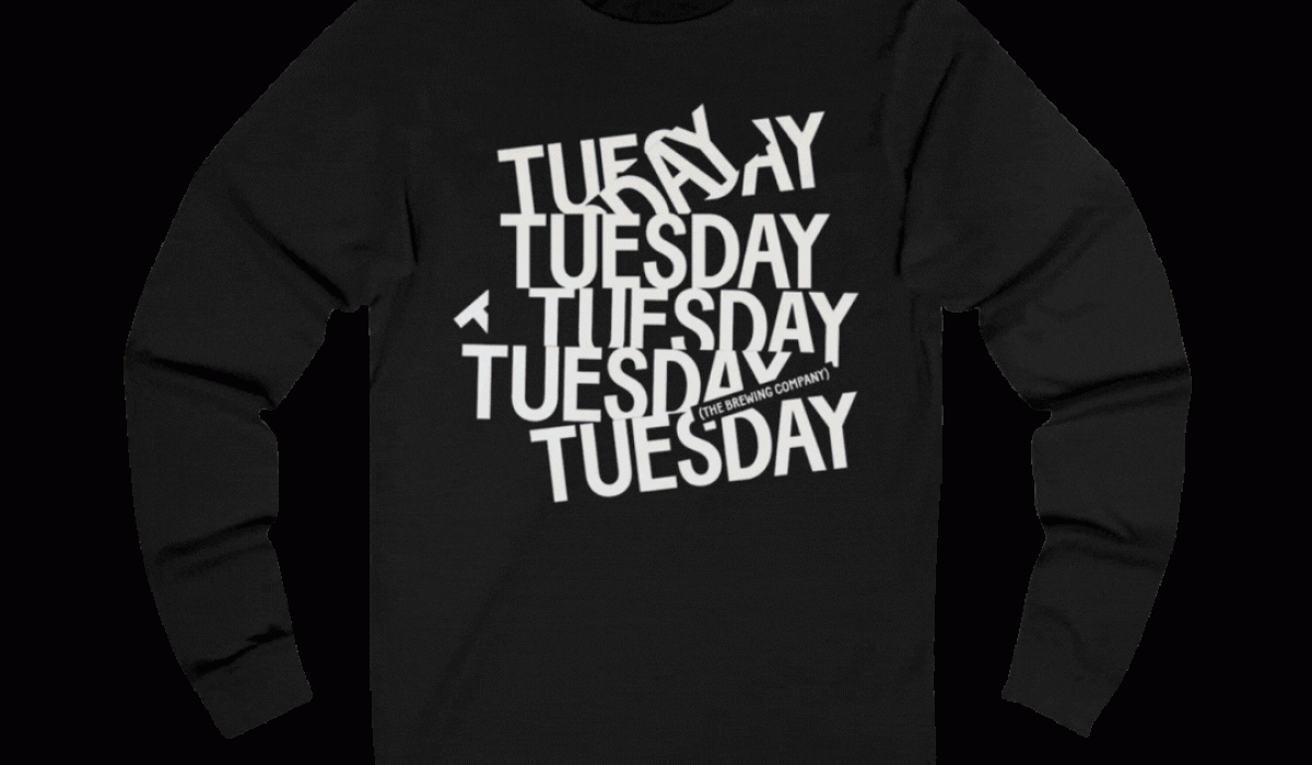
TUESDAY BRAND SUPPORT + MERCH DESIGN
As Senior Designer at Redphone, I was lucky enough to work with TUESDAY Brewing Co. A brewery that is unapologetically driven to producing the best tasting Non-Alcoholic beer. As Senior Designer, I worked closely with the Creative Director and Art Director to bring a wide range of brand and marketing initiatives to life. My responsibilities included: Designing marketing collateral Developing social media content, including some photography. Planning photoshoots, particularly collaborating on and creating detailed shot lists to support the art direction and visual storytelling. Providing design support for TUESDAY’s business needs, such as sell sheets, presentations, and website content updates. Curating and implementing the launch of TUESDAY’s Merch program The launch of the merch program was a particularly exciting opportunity where I had a lot of free rein, while collaborating closely with the Creative Director and Art Director, I researched different Print On Demand companies, set up the client’s account, and utilized existing brand assets to create fun and active apparel/products that reflected TUESDAY’s cheeky and sporty attitude. I also created graphics for the rollout. This role blended hands-on creative execution with collaborative brand development, allowing me to contribute meaningfully across strategy, content, and production.
Read More ›
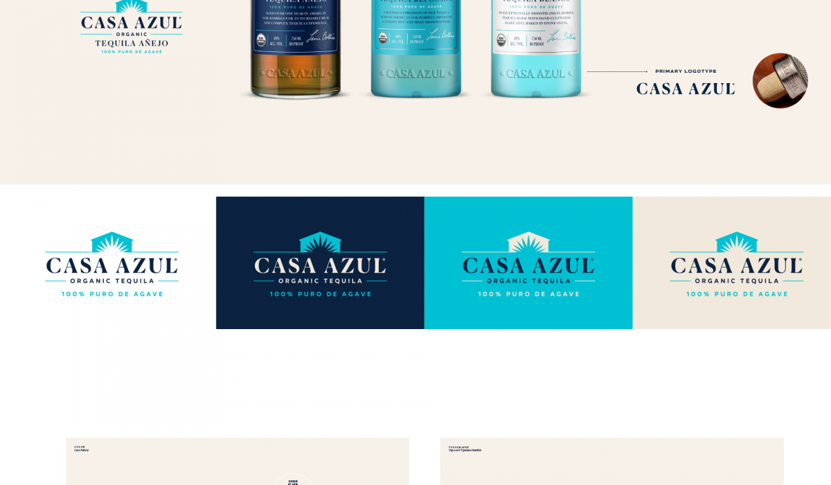
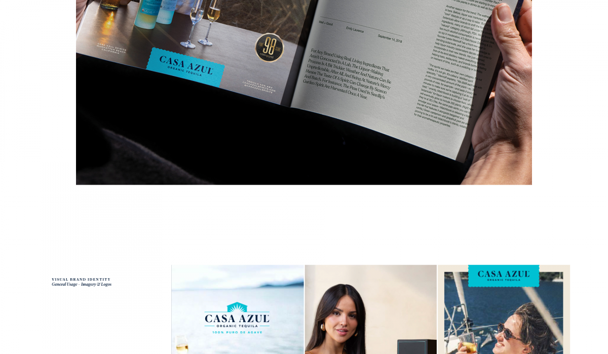
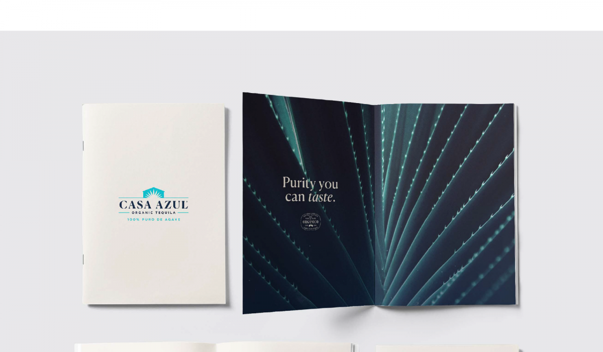
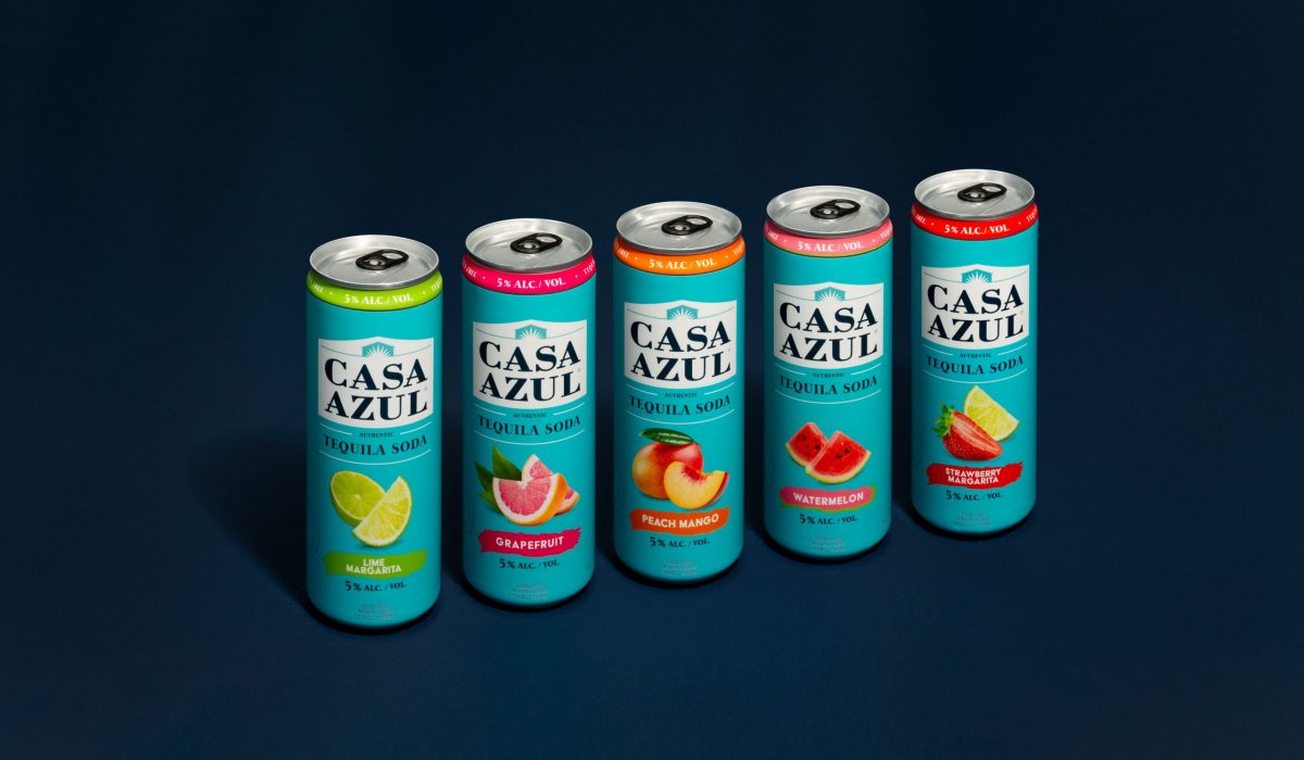
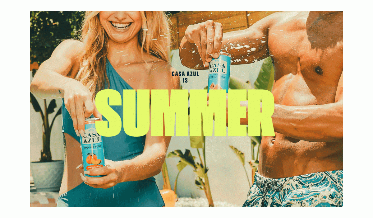
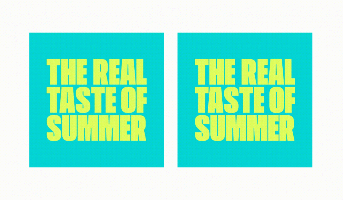
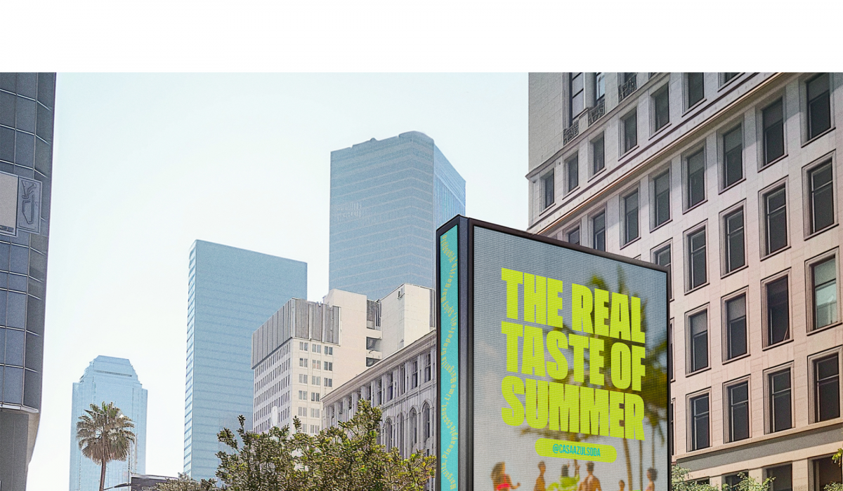
CASA AZUL BRAND AUDIT + MARKETING COLLATERAL
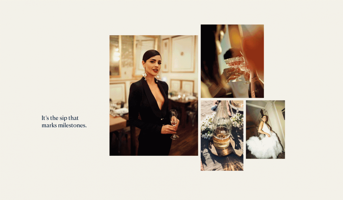
As Senior Designer at Redphone, in tandem to executing on ad-hoc marketing collateral, I worked alongside the Creative Director and Art Director to conduct a brand audit of Casa Azul. Casa Azul Organic Tequila—a premium, luxury spirit—needed to stand apart from its sibling brand, Casa Azul Tequila Soda. While the soda embraces a more casual, sun-soaked vibe, the organic tequila leans into elevated, artisanal qualities. Through this audit, we helped define a clearer brand hierarchy and recommended visual and tonal distinctions that would reinforce their individual identities while maintaining family cohesion. I also assisted in the planning for the Real Taste Of Summer photoshoot, specifically with the shot list, as well as editing the images after the shoot.
Read More ›
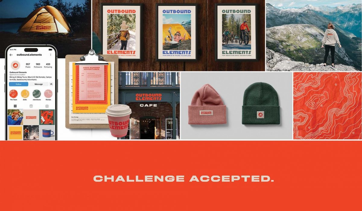
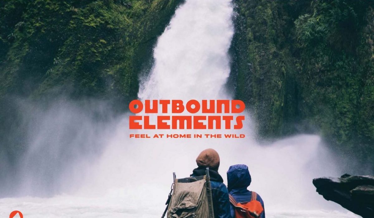
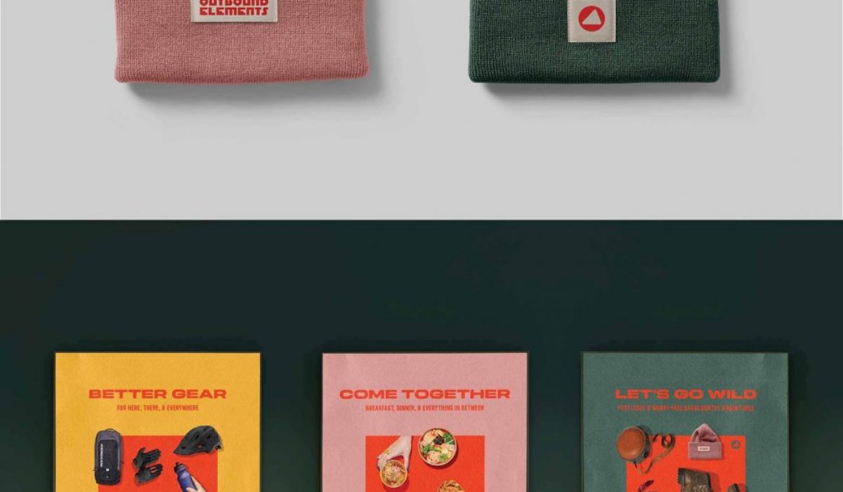
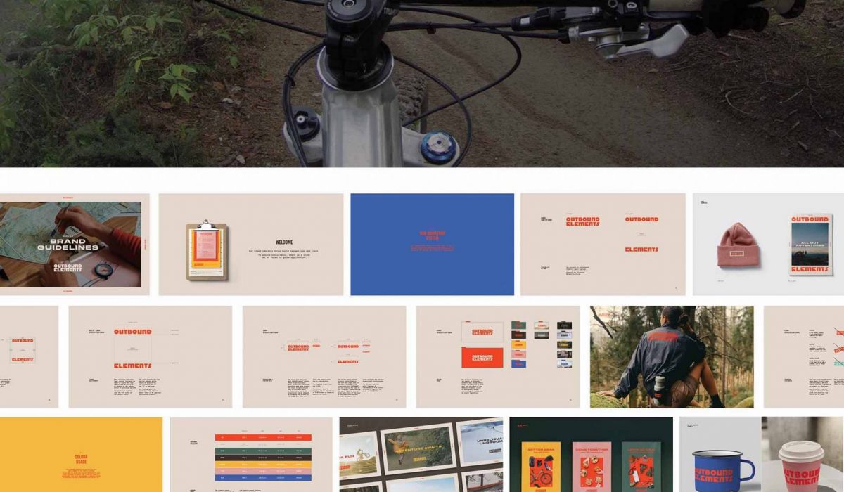
OUTBOUND ELEMENTS: ADVENTURE TOURISM REBRAND
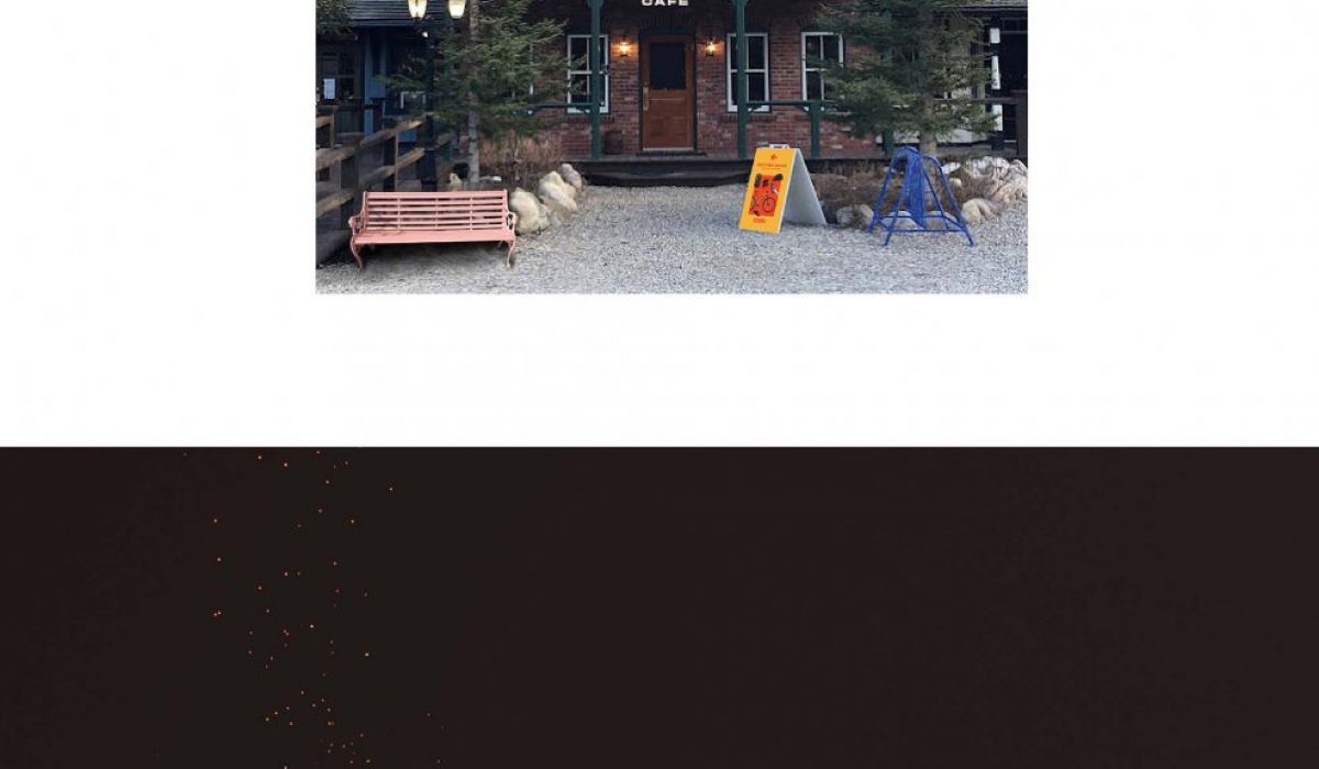
AN OUTDOOR ADVENTURE BRAND, WITH GERMAN ROOTS. Outbound Elements is a family-owned company providing unforgettable outdoor guided experiences for Albertans and tourists alike. For outdoor enthusiasts, families, or corporate retreats. They offer equipment rentals, skills development and kids camps. Right next door is their Living Room cafe to settle into upon your return from the wilderness—it’s the perfect spot to plan your next adventure. THE BRAND IS ENERGETIC AND APPROACHABLE, WHILE INSTILLING A SENSE OF TRUST AND RELIABILITY. While at Redphone as a Senior Graphic Designer I had the pleasure to work with the creative team on this identity development. Collaboratively we worked out the concept and direction. I executed on the identity development with feedback from the Creative Director and Art Director. Upon approval from the client I built out the brand guidelines and final assets.
Read More ›
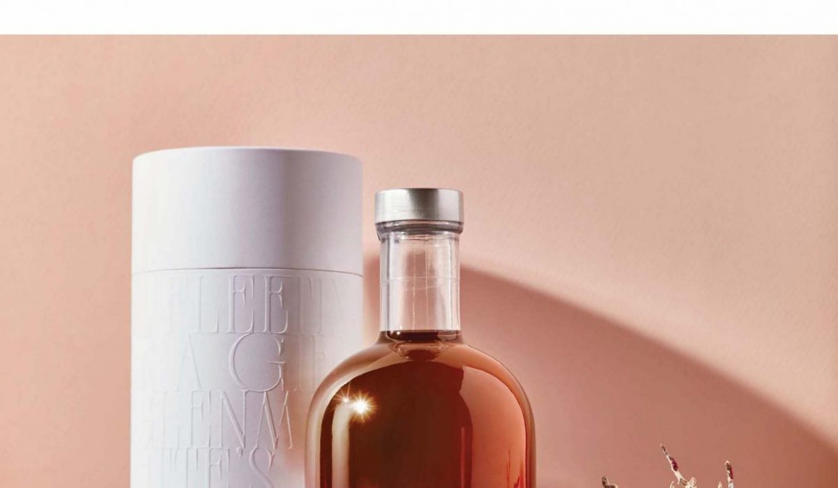
GLENMORE PRINTING GOLDEN RUM PACKAGING
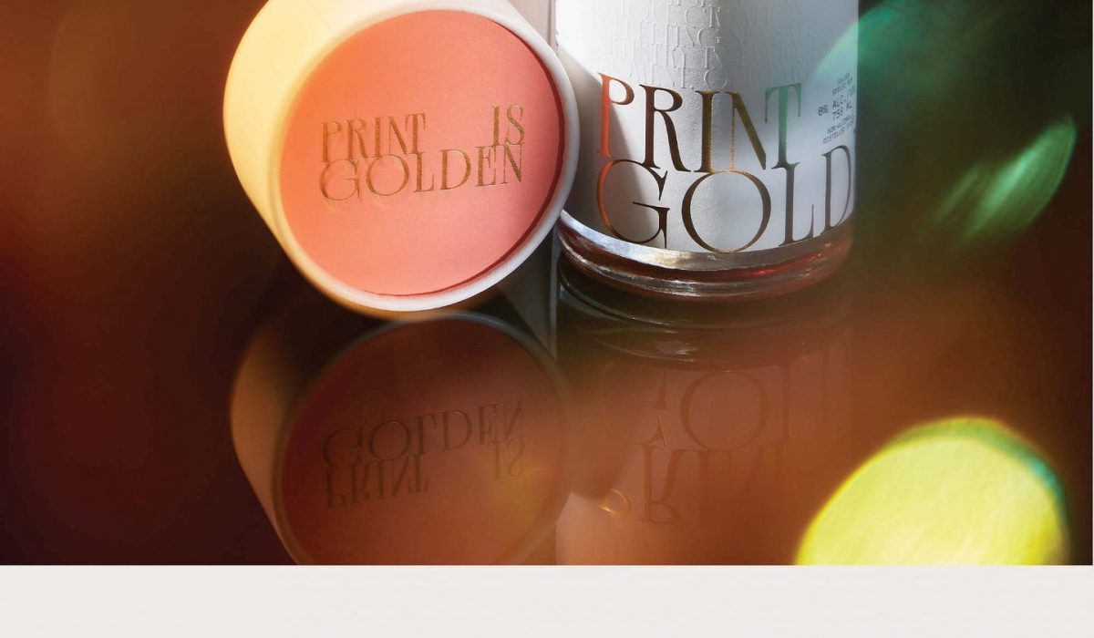
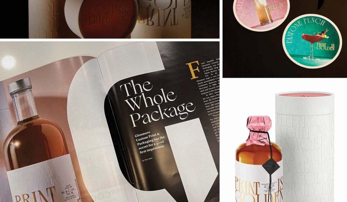
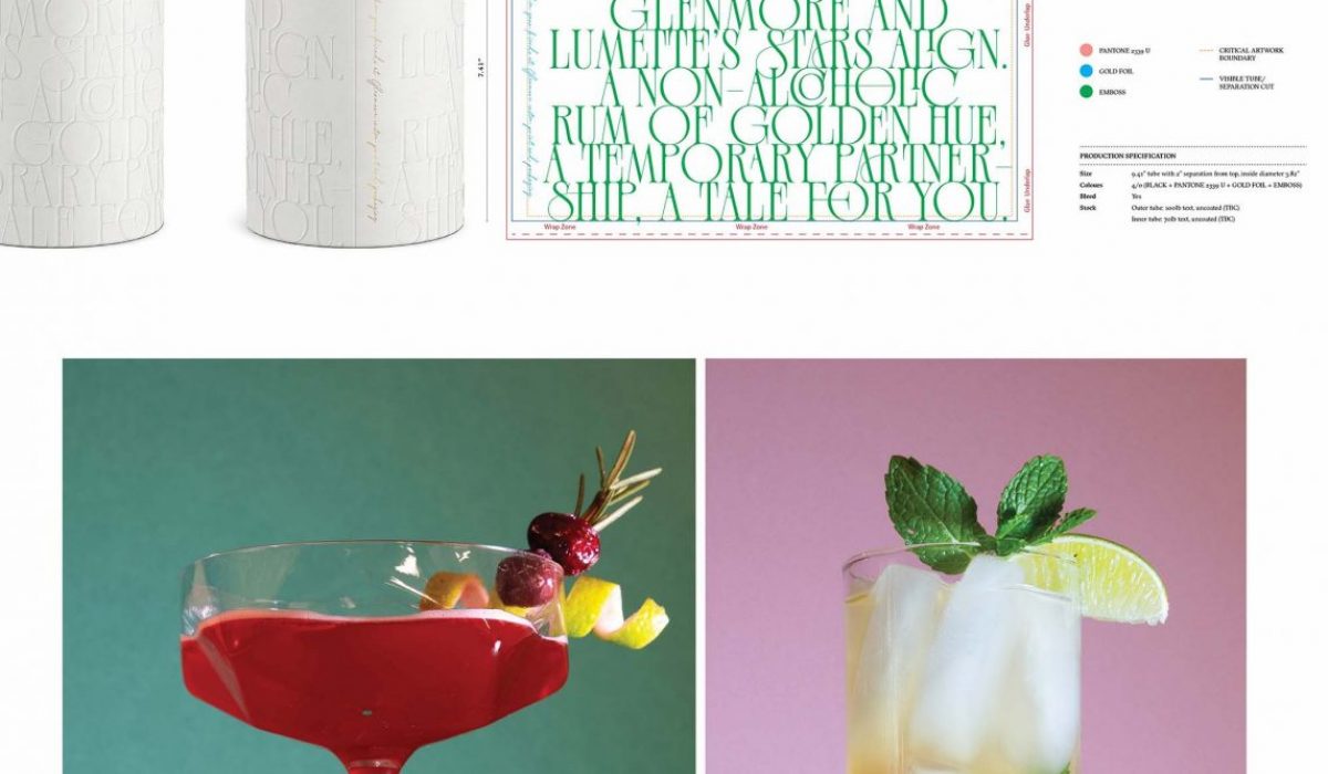
PACKAGING DESIGN FOR CANADA’S TOP CUSTOM MANUFACTURER OF PACKAGING SOLUTIONS. Glenmore Printing wanted to send a bottle of non-alcoholic golden rum to cherished clients that would honor their commitment to craft and imaginative, cutting-edge packaging solutions We created custom dielines for the telescopic tube, and label. We used different paper stocks, multiple finishes including gold foil, and embossing. & golden rum was meant to be mixed, so we also created festive recipes for cocktails. I made the drinks, and assisted with staging during the photoshoot. A pristine white uncoated telescopic tube embossed with the story of a partnership is opened to reveal a gold inner tube with a gracious message set inside from Glenmore Printing. Below, gorgeous coasters with delicious photos of drinks and recipes sit atop a bottle of golden hue. Hugging the bottle, a clean while label with subtle embossing and gold foil. An additional ruffled rose label for ingredients and a branded matte black with black foil Glenmore sticker to seal with rose tissue paper and gold string. PRINT IS GOLDEN ENCAPSULATES GLENMORE’S TIRELESS DEDICATION TO THEIR TRADE AND REVERENCE FOR THE INTRICATE WORLD OF PACKAGING. While at Redphone as a Senior Graphic Designer I had the […]
Read More ›
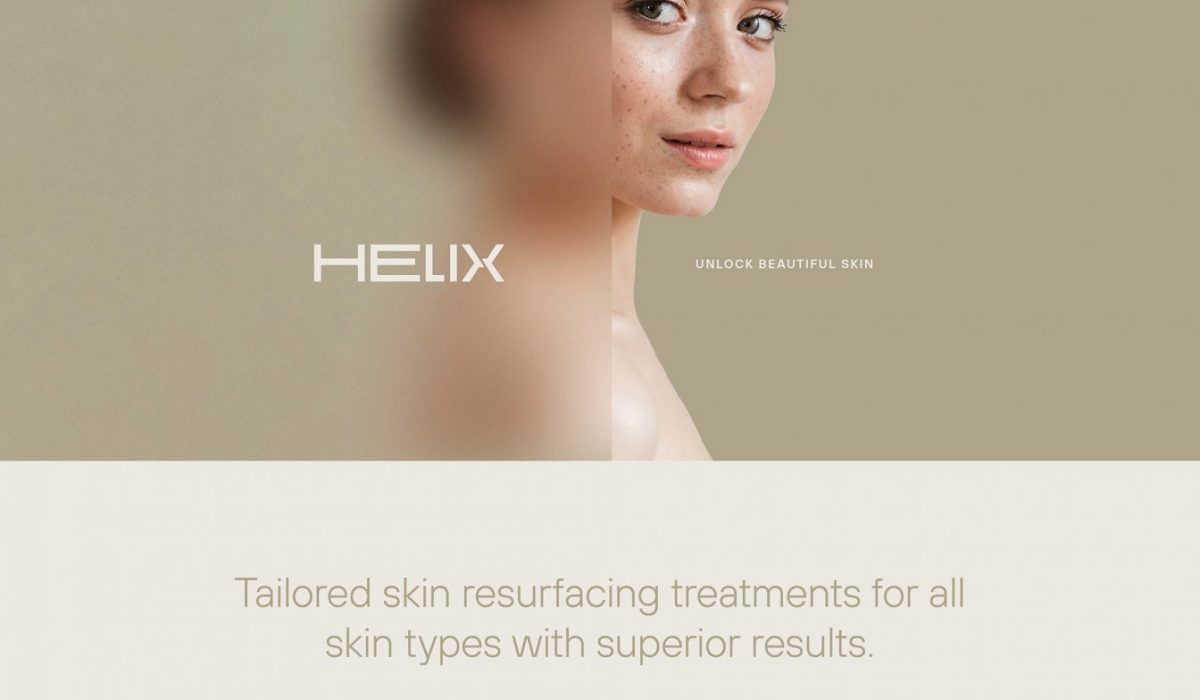
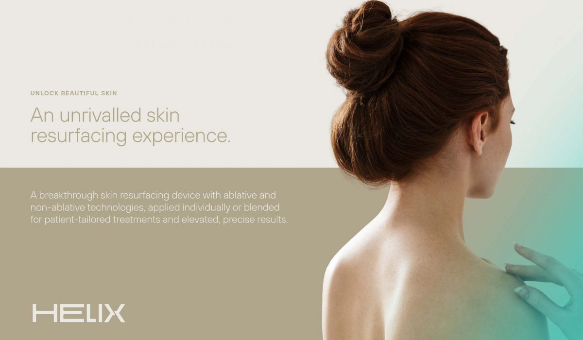
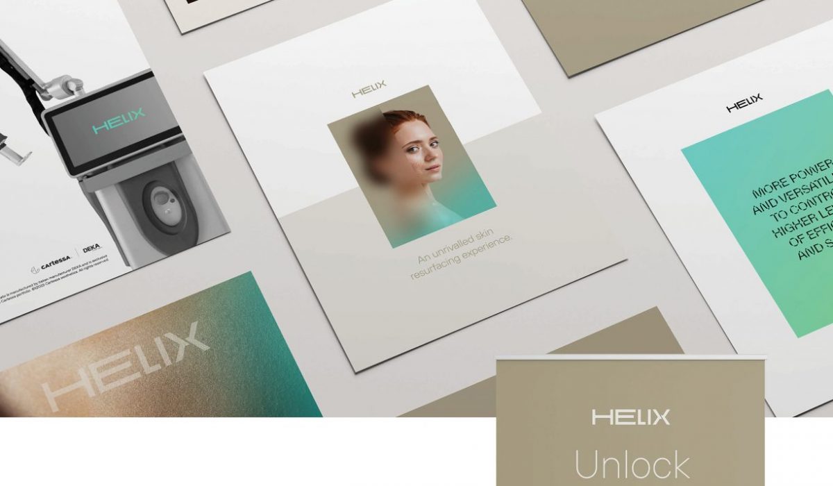
CARTESSA AESTHETICS EQUIPMENT BRANDING
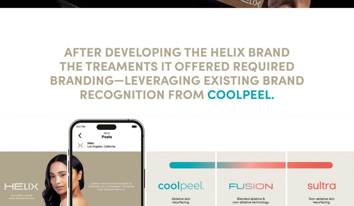
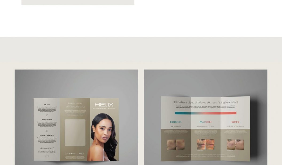
CARTESSA AESTHETICS—LASER EQUIPMENT SUPPLIER IN NEW YORK. With exclusive global relationships, best-in-class technology, and end-to-end support, Cartessa empowers the best aesthetic providers to achieve more. While at Redphone as a Senior Graphic Designer I had the pleasure to work with the creative team on this intricate client. We developed a parent brand on a device and brands for 2 treatments that required leveraging on an existing brand—coolpeel.
Read More ›
SIMON DATA BRAND FACELIFT + MARKETING COLLATERAL
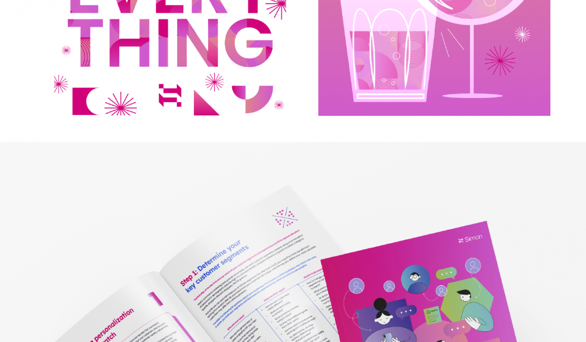
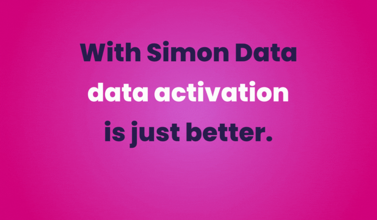
Simon Data has taken on a brand facelift, something to make their tech brand more playful, and personable. With the below homepage as reference I updated onesheets, social media assets, ebooks, presentation decks, illustrations, and icon sets to match the refreshed color scheme and logo.
Read More ›
DIGITAL MONK BRAND EXPANSION
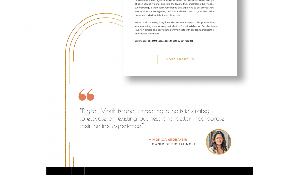
DMM was very happy with their existing logo, eye icon, planet imagery and color scheme, but the pieces did not connect and the brand message was getting lost. We outlined what Digital Monk meant, and discussed the founder’s vision: innovative, evolving, modern, humble, and ethereal were some key words we identified. This prompted me to take inspiration from the Art Deco movement, with its affinity for fine craftsmanship, and faith in technological pursuits I leaned into the use of gold, geometric forms, pattern, and nature. This gave the gold circle from within their logo purpose: Digital Monk looks at the whole picture, and puts the puzzle pieces together – we make our client’s brands whole. The idea of being whole prompted a focus on circles within the iconography and photography. I added a secondary font with an art deco flare, and included more space imagery to emphasize DMM’s birds eye view. This revamp included their website, stationary, newsletter template and social media content. Creating meaning and cohesion behind each touchpoint has elevated the DMM brand.
Read More ›
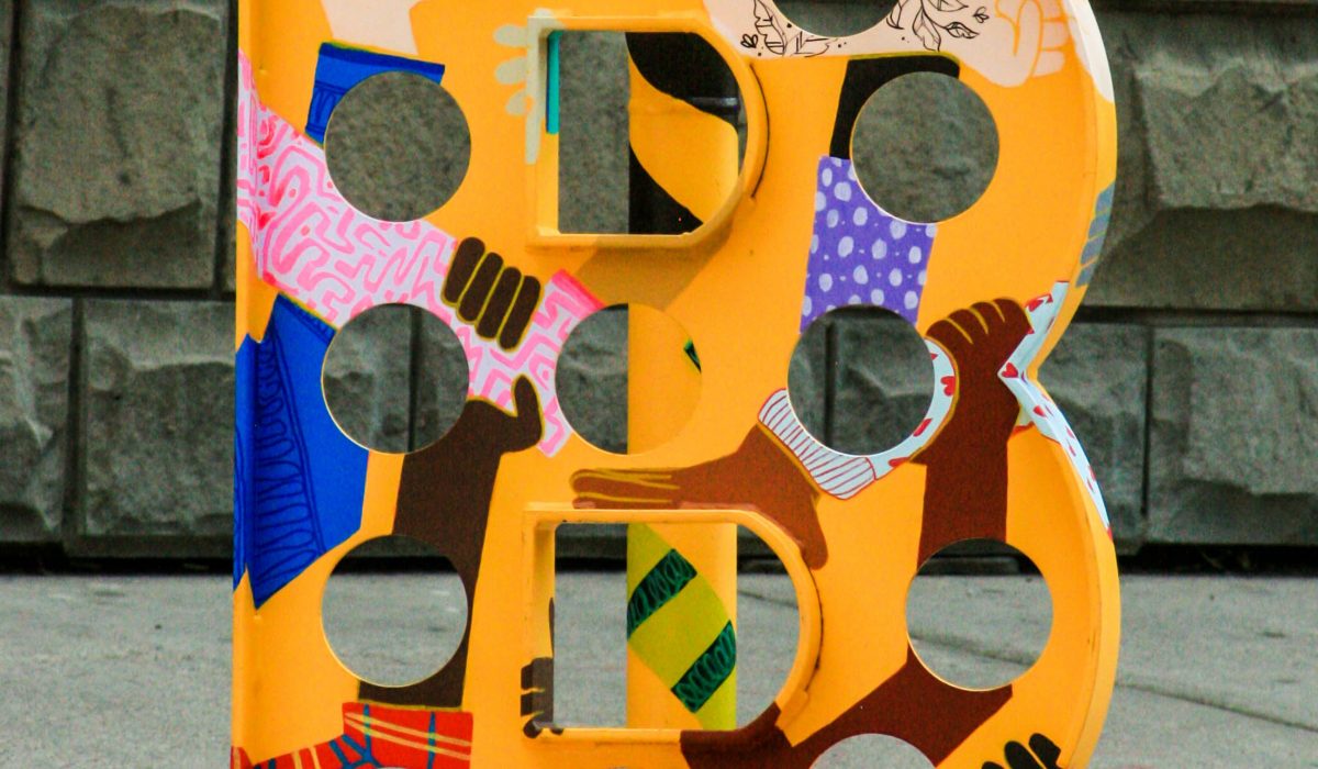
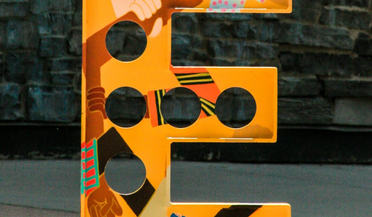
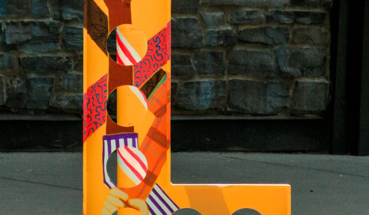
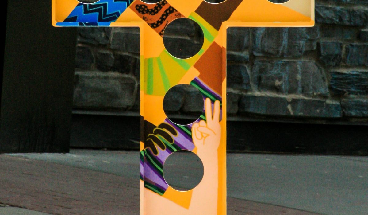
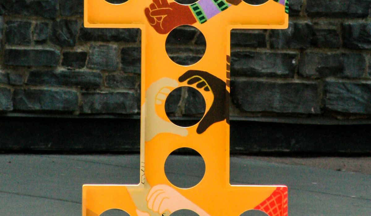
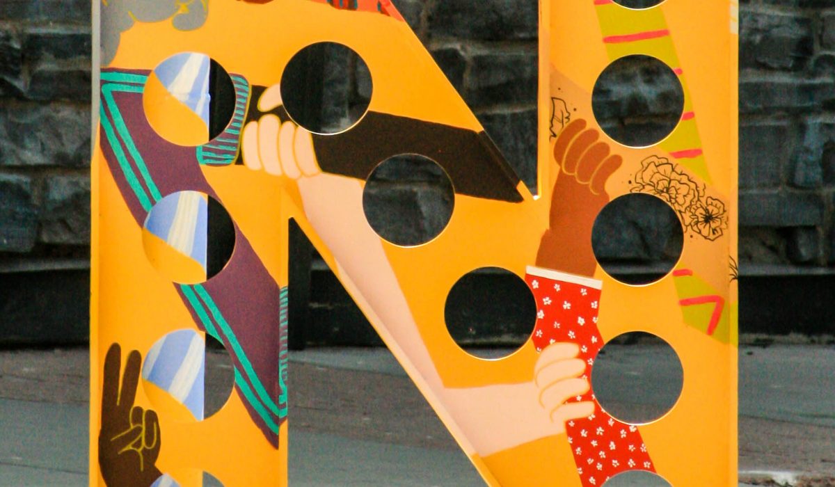
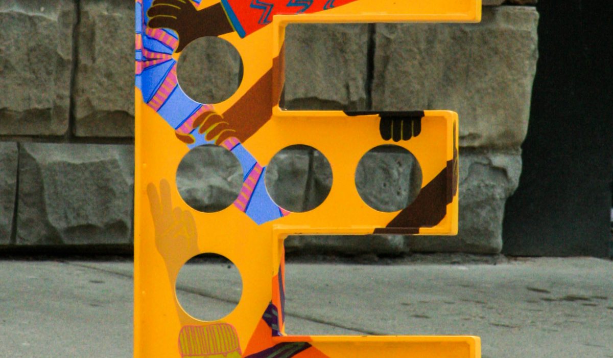
CALGARY—BELTLINE BIKERACK INSTALLATION
I was selected from a Call to Artists to transform the YYC Beltline bike racks. I spent 12 days painting the mural – and in keeping with typical Calgary May weather I argued with the rain, basked in the sunlight and finished the piece 6 hours before the snow. Better Bike Racks and The Blox YYC put out a request for submission of a design depicting a social issue of 2020. But at the time I needed to focus on moving forward – on inclusivity and interconnectivity. No beginning or end, but wanting to learn and grow. I am so honoured to have had a platform to express myself in a community I love, and on such a unique canvas. This project will always be special to me as my first public art piece, I hope that it causes others as much joy as it gave me. It was a dream come true and an area I wish to continue pursuing. Two Word Productions created the amazing video below documenting the project.
Read More ›