Brand Expansion
DMM was very happy with their existing logo, eye icon, planet imagery and color scheme, but the pieces did not connect and the brand message was getting lost. We outlined what Digital Monk meant, and discussed the founder’s vision: innovative, evolving, modern, humble, and ethereal were some key words we identified. This prompted me to take inspiration from the Art Deco movement, with it’s affinity for fine craftsmanship, and faith in technological pursuits I leaned into the use of gold, geometric forms, pattern, and nature. This gave the gold circle from within their logo purpose: Digital Monk looks at the whole picture, and puts the puzzle pieces together – we make our client’s brands whole. The idea of being whole prompted a focus on circles within the iconography and photography. I added a secondary font with an art deco flare, and included more space imagery to emphasize DMM’s birds eye view. This revamp included their website, stationary, newsletter template and social media content. Creating meaning and cohesion behind each touchpoint has elevated the DMM brand immensely. See below for their previous website. 2021 Web Design Branding, Design, Web Infographic Branding, Design, Illustration, Typography, Web
Read More ›
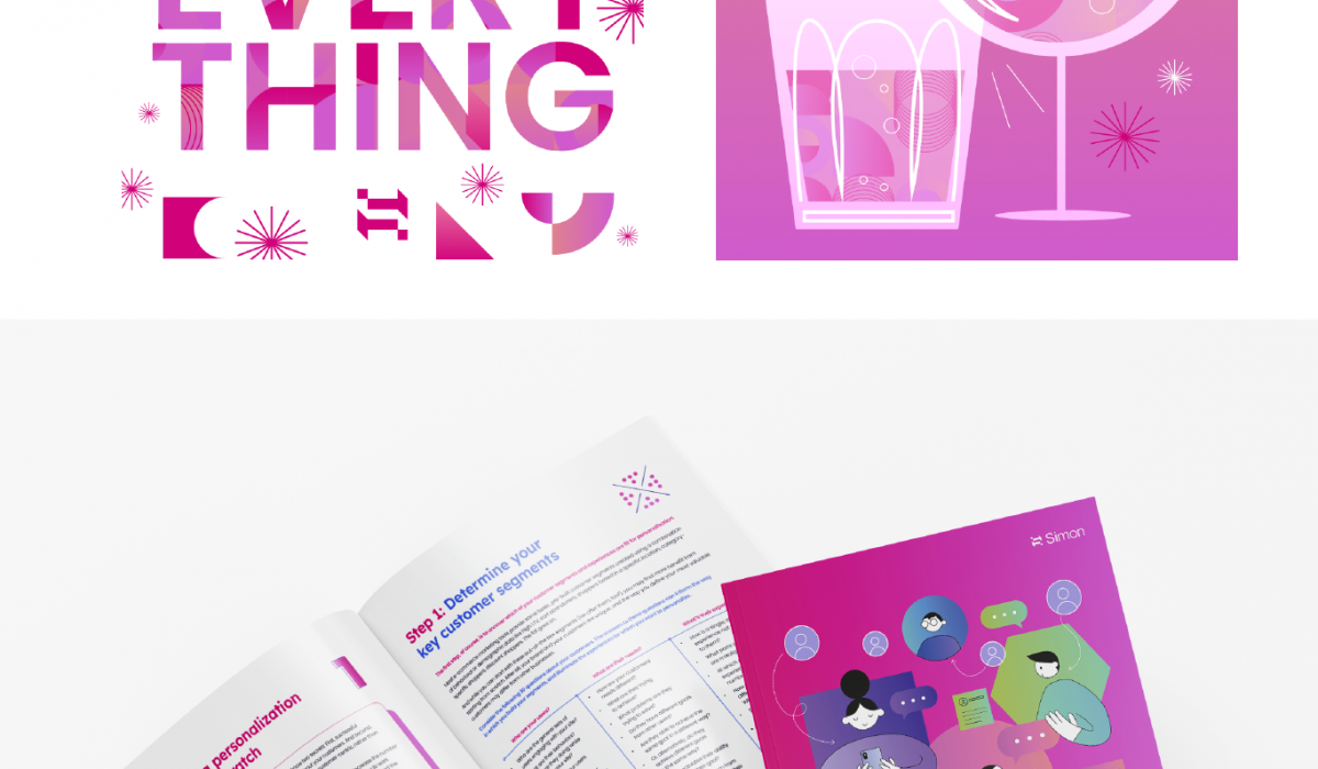
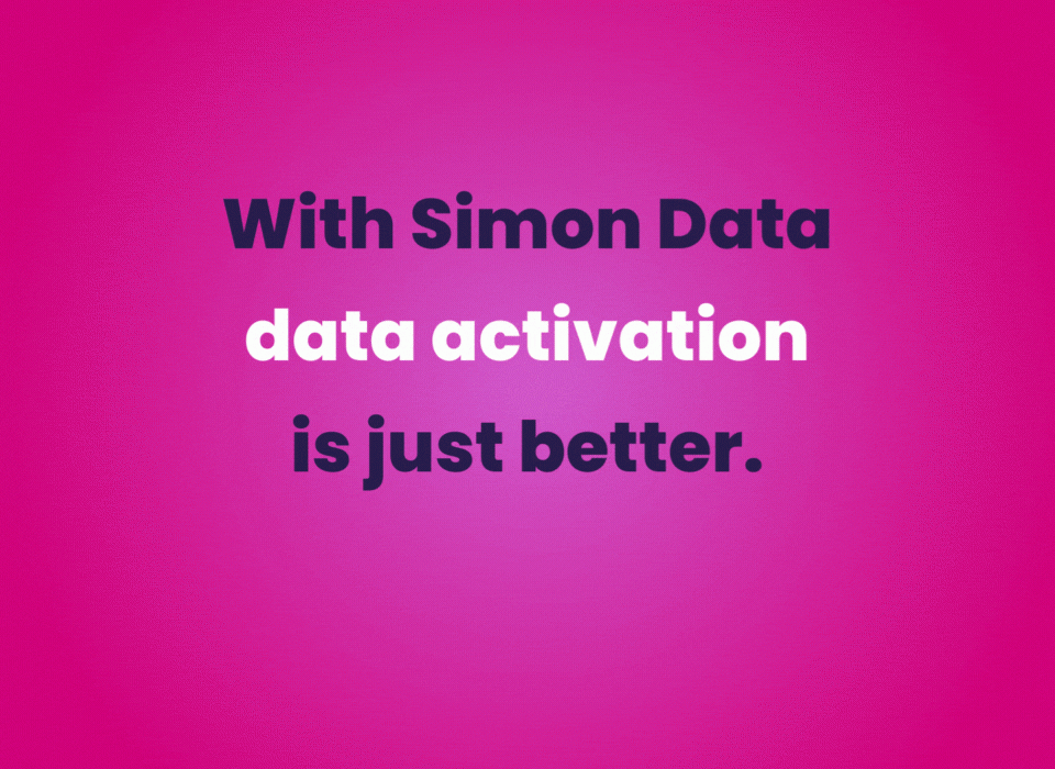
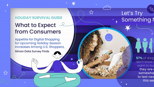
Brand Facelift
Simon Data has taken on a brand facelift, something to make their tech brand more playful, and personable. With the below homepage as reference I updated onesheets, social media assets, ebooks, presentation decks, illustrations, and icon sets to match the refreshed color scheme and logo. Editorial Design Branding, Design, Illustration, Typography, Web Alter Ego Archive
Read More ›
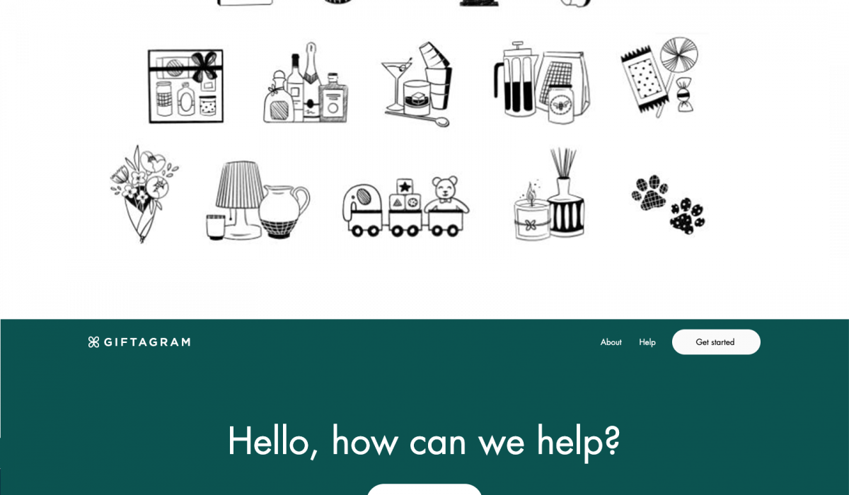
Branded Illustrations
Giftagram is a corporate gifting platform that helps companies recognize employees, and thank or engage with clients with thoughtful gifting moments. The series of illustrations created in collaboration with Presley Mills were designed for use in direct-to-consumer messaging. They represent the benefits and unique features of using a platform like Giftagram. We also created icons for each category offered. Info Design Design, Maker Product Design Archive
Read More ›
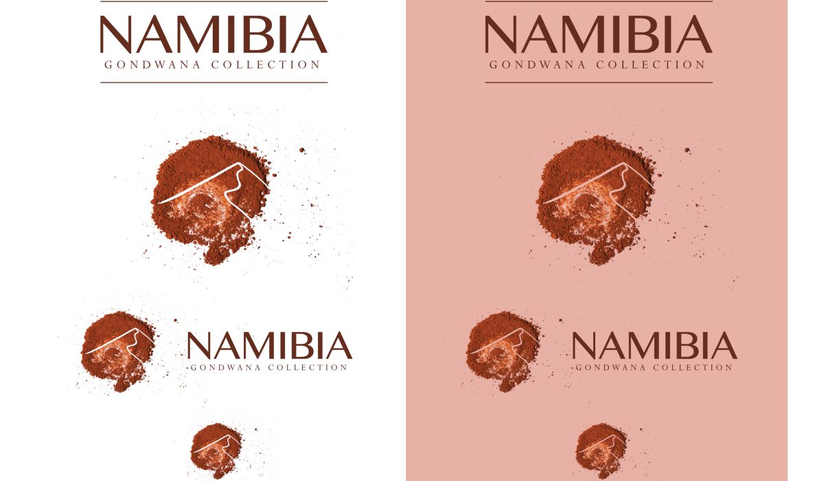
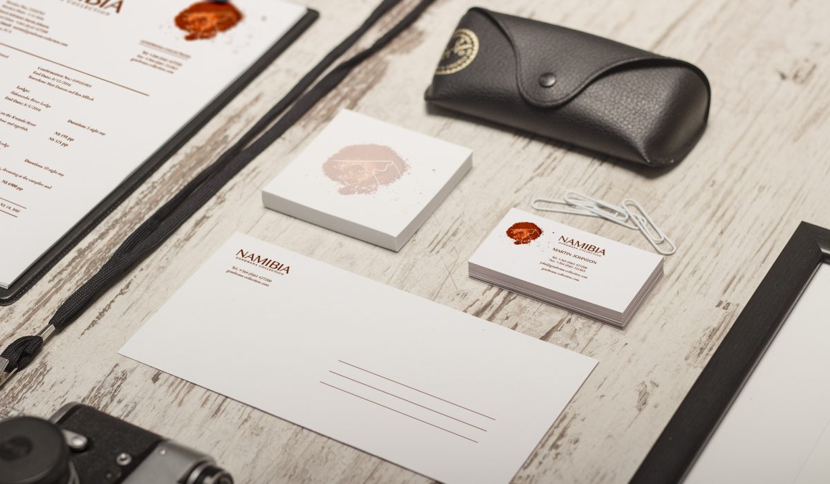
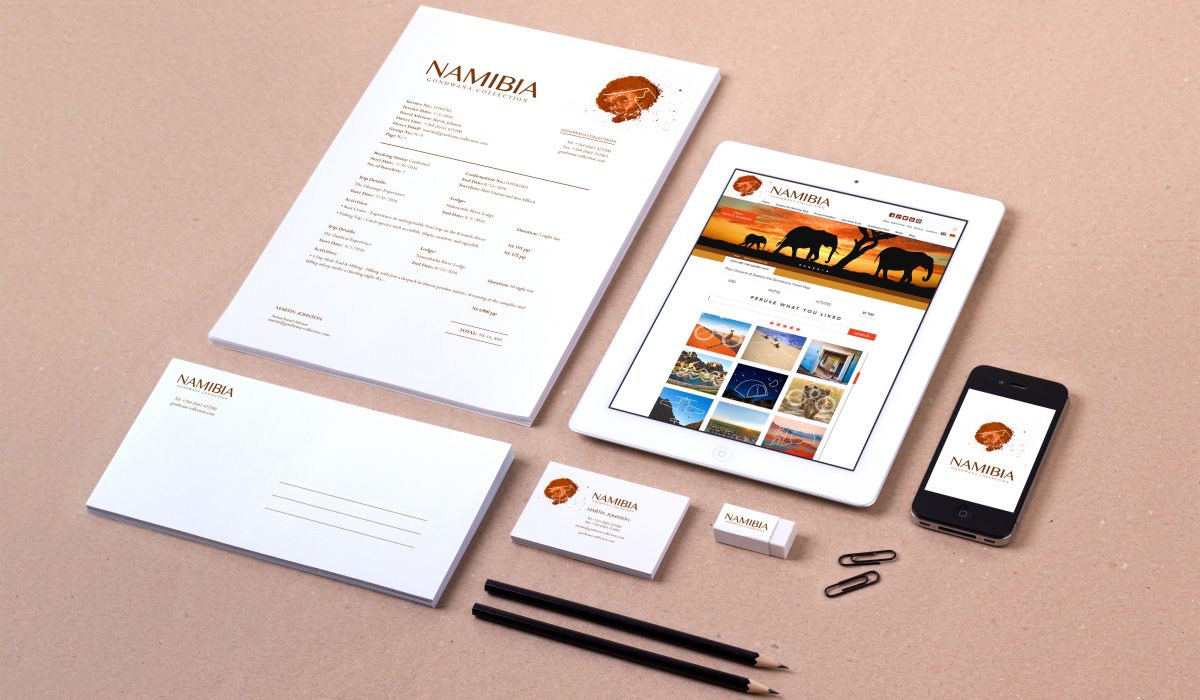
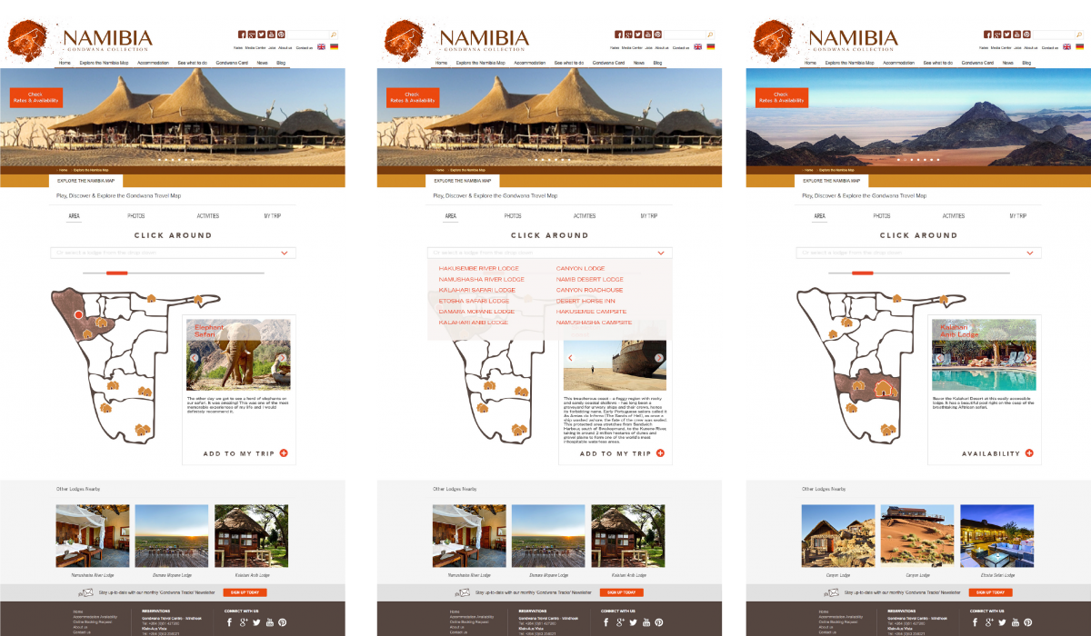
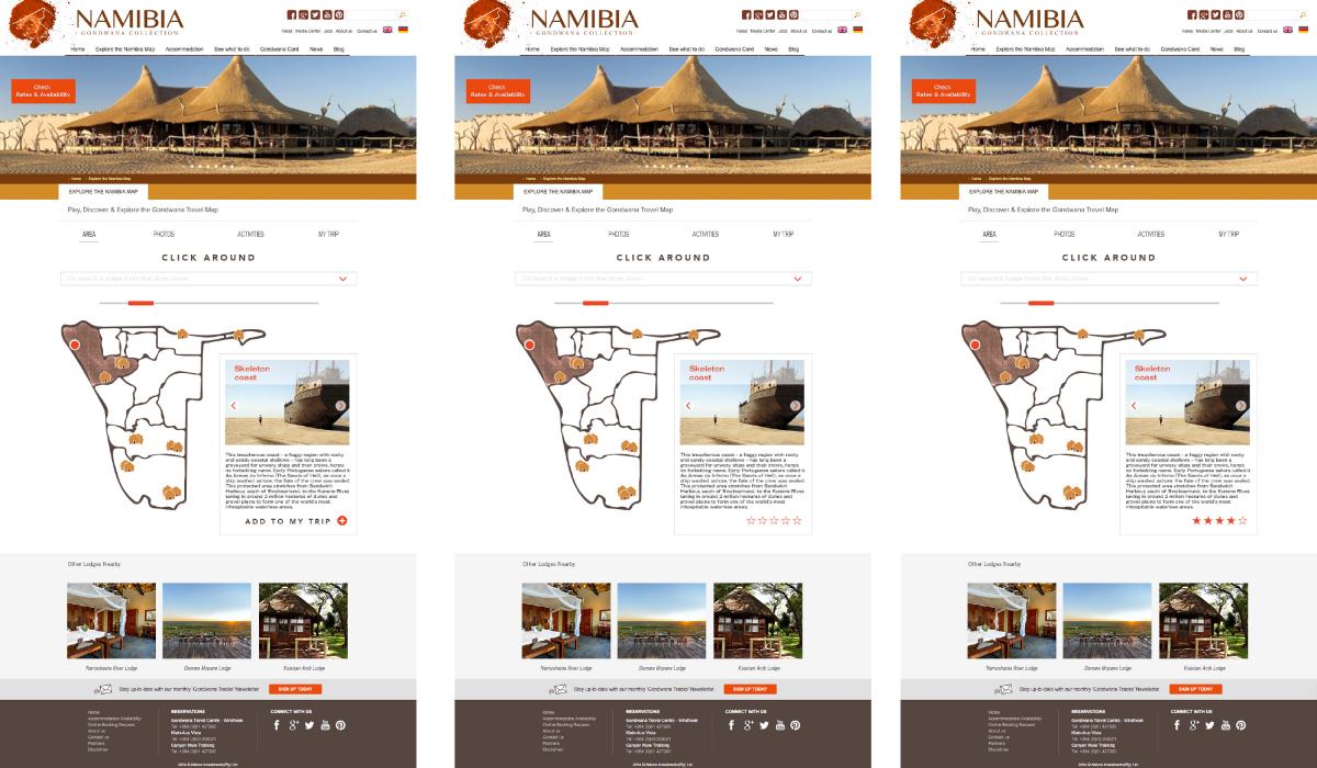
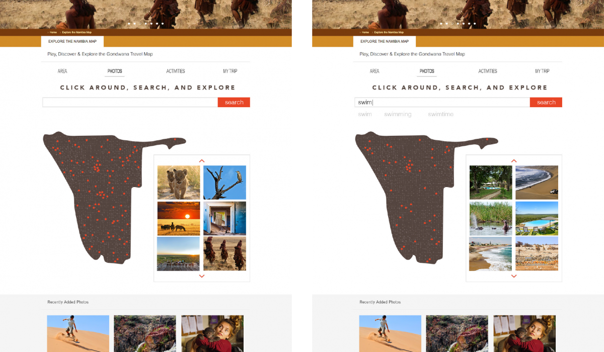
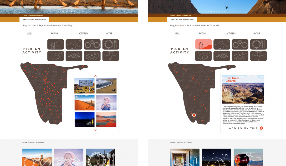
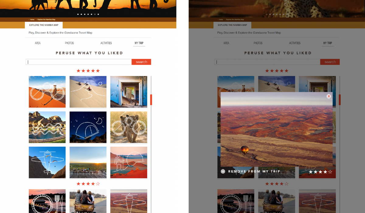
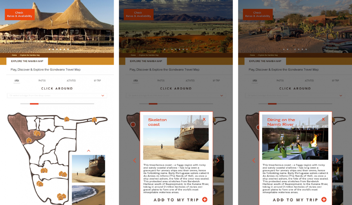
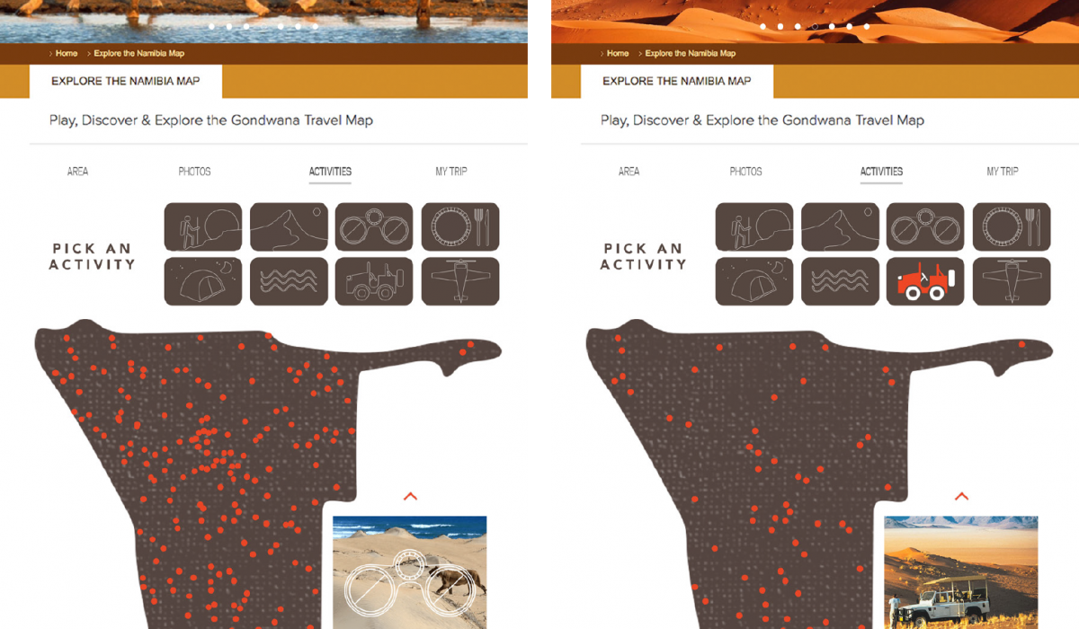
Namibia Branding
This project was to take an existing travel company’s brand tactic and improve it in some way. Gondwana Collections • Namibia “Namibia with Heart and Soul: Take our hand and let us introduce you to this awe-inspiring country. Come and stay with us, experience Namibia.” In 2014 Gondwana Collections did a complete visual rebranding so the traveller could “Feel Closer”. I redesigned the logo to be something tangible so the traveller could feel as though they had already touched the red Namibian dessert. For the brand tactic I chose their ‘Explore the Namibia Map’ webpage. There is a google map that allows you to click from lodge to lodge and get a bit of info, but I wanted the user to be able to do a lot more. Linking the map with social media could allow the user to browse many photos, but best of all, be able to prioritize everything they might want to do, and know exactly where to find it! This way they will be able to make the best of their trip, and feel confident about making the journey. Watch the video to see how it would function.
Read More ›
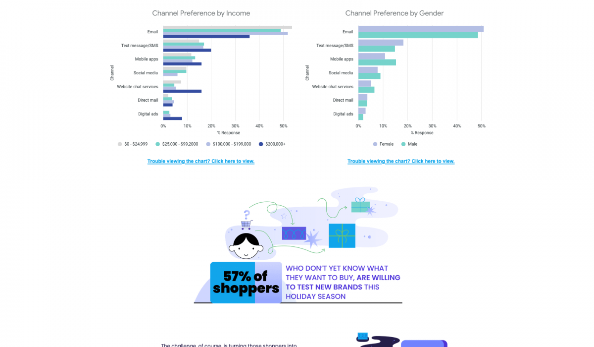
Infographic
This is an infographic created in support of a Holiday Hub landing page. The client and I thought it would be unique to do a horizontal scroll rather than vertical.
Read More ›
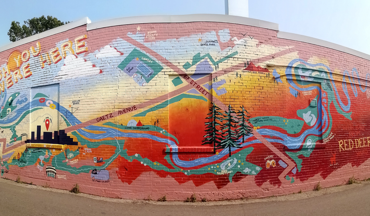
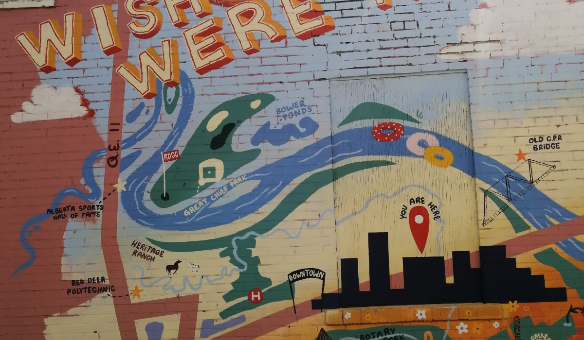
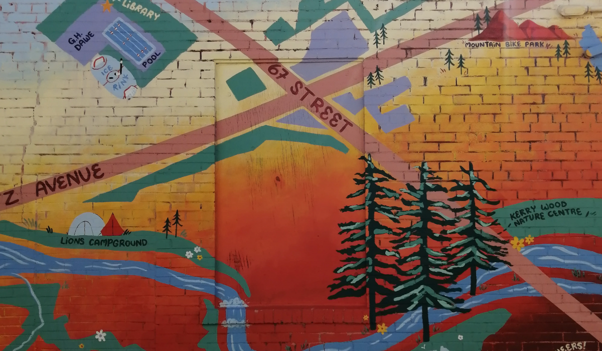
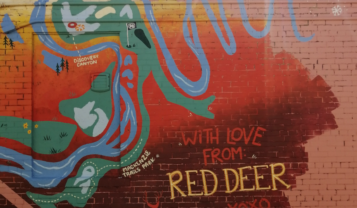
Wish You Were Here
I was lucky enough to be a part of Red Deer’s 2022 Mural Festival “Meet the Streets”. I was paired with a business that wanted a vintage post card vibe. I created an abstract map of Red Deer titled “Wish You Were Here…With Love From Red Deer”.
Read More ›
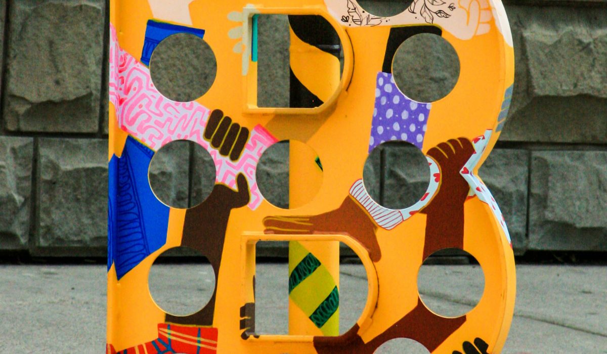
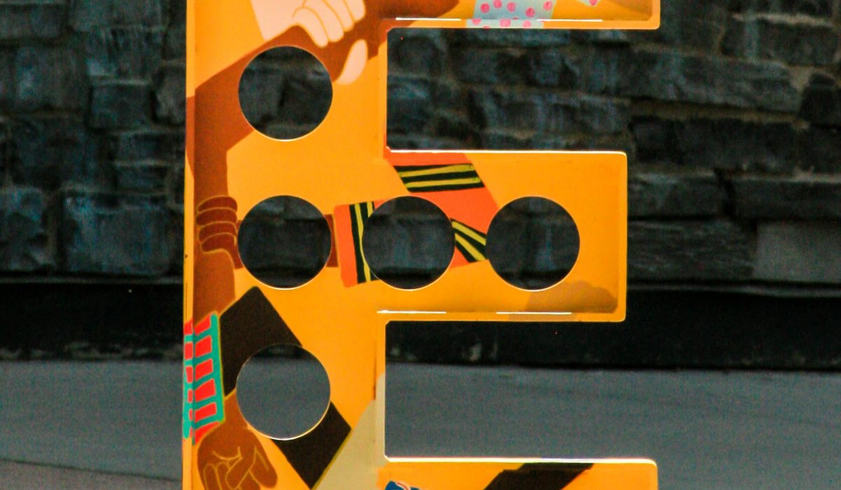
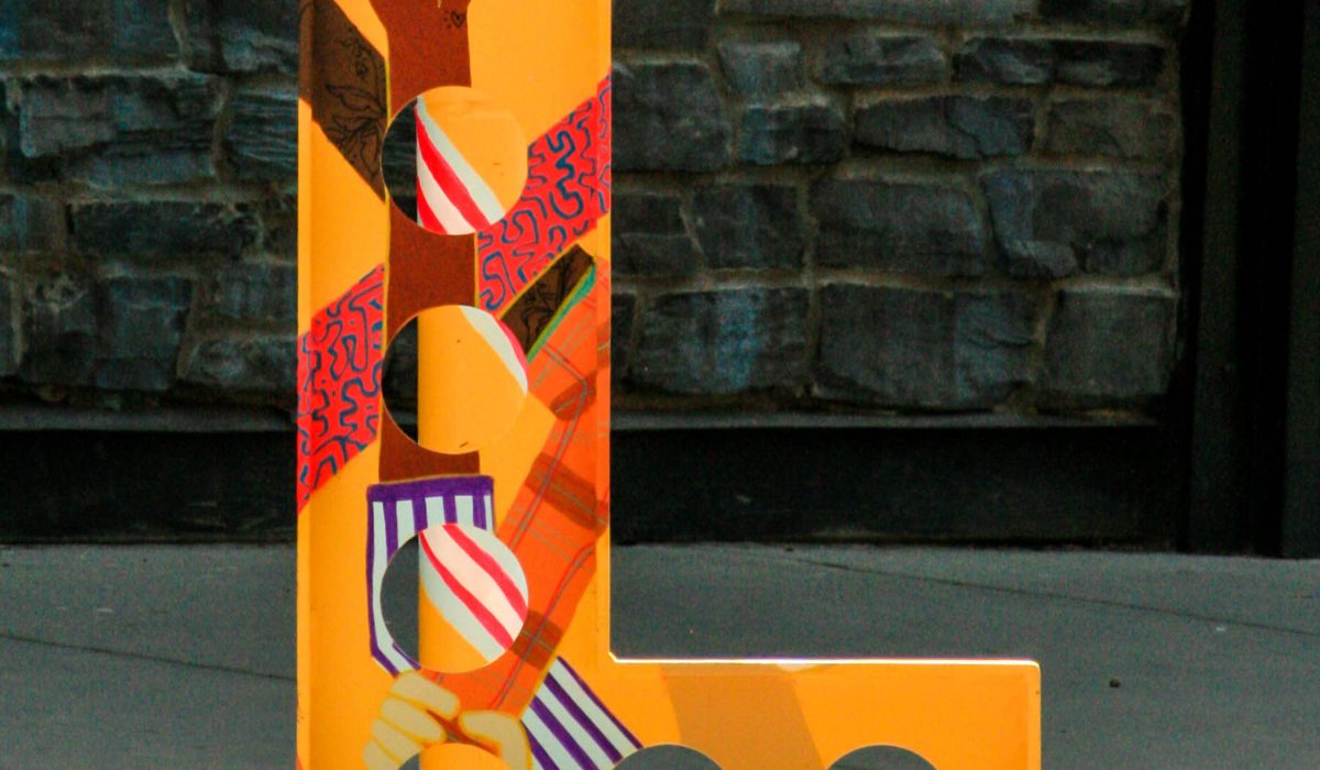
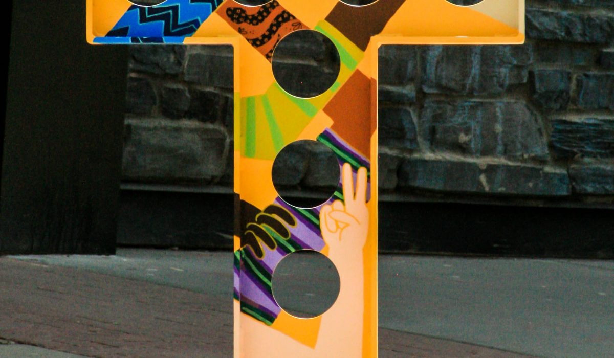
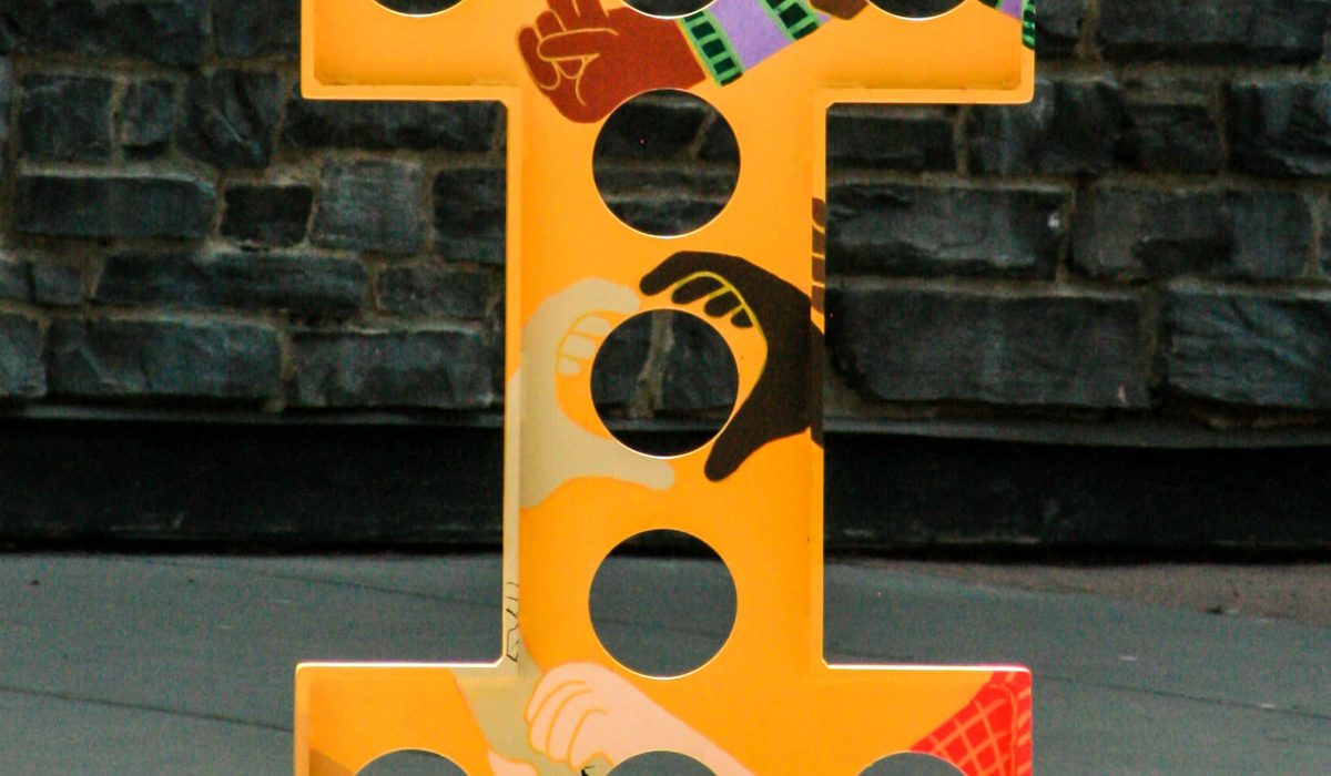
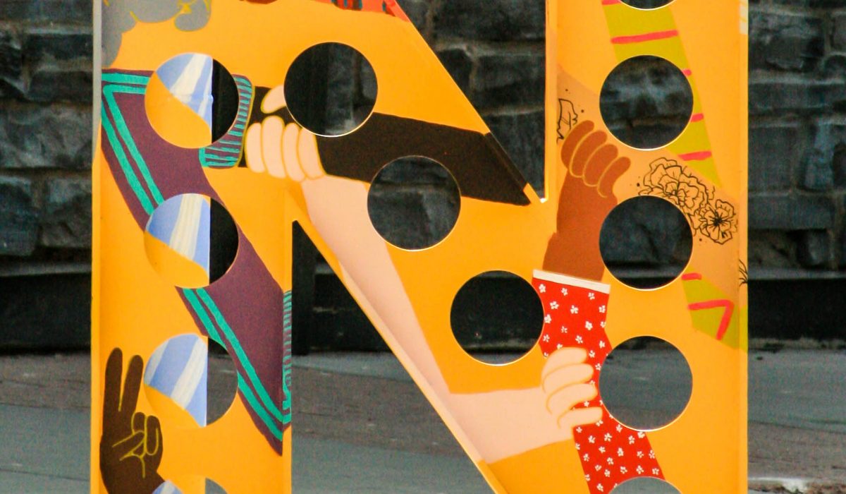
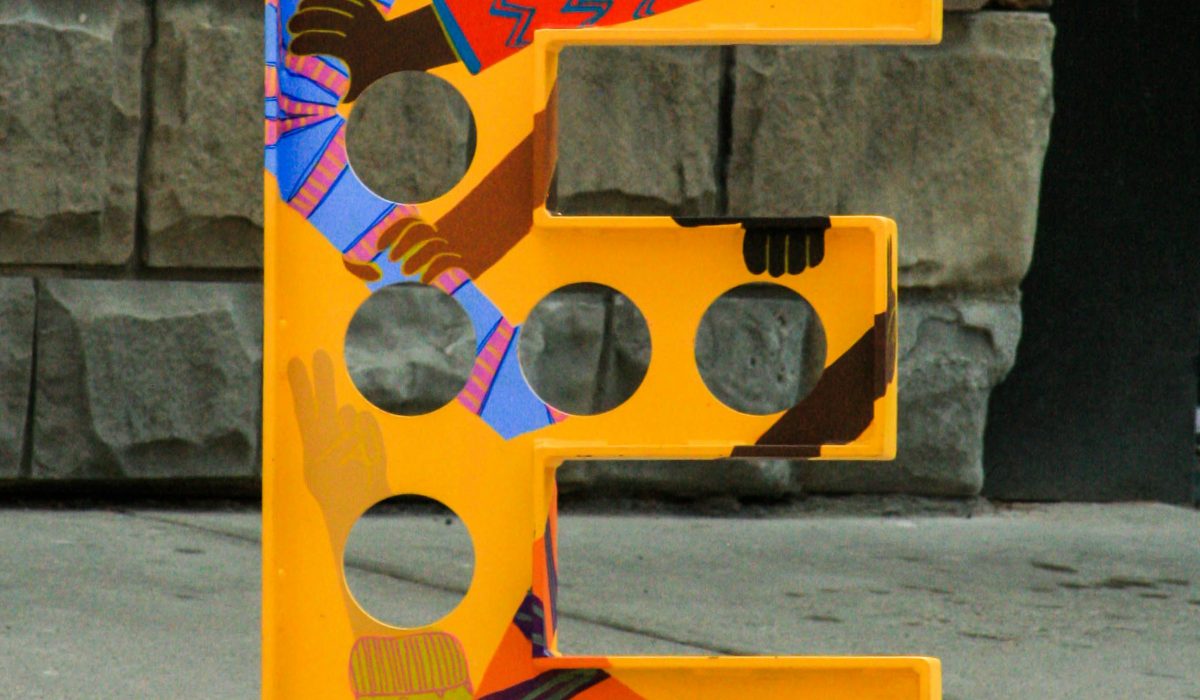
YYC Beltline Bike Rack
I was selected from a Call to Artists to transform the YYC Beltline bike racks. I spent 12 days painting the mural – and in keeping with typical Calgary May weather I argued with the rain, basked in the sunlight and finished the piece 6 hours before the snow. Better Bike Racks and The Blox YYC put out a request for submission of a design depicting a social issue of 2020. But at the time I needed to focus on moving forward – on inclusivity and interconnectivity. No beginning or end, but wanting to learn and grow. I am so honoured to have had a platform to express myself in a community I love, and on such a unique canvas. This project will always be special to me as my first public art piece, I hope that it causes others as much joy as it gave me. It was a dream come true and an area I wish to continue pursuing. Two Word Productions created the amazing video below documenting the project.
Read More ›
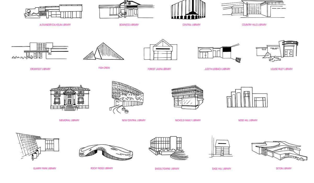
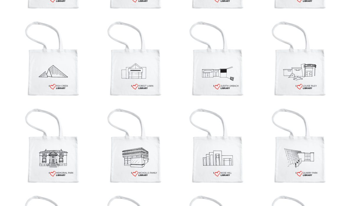
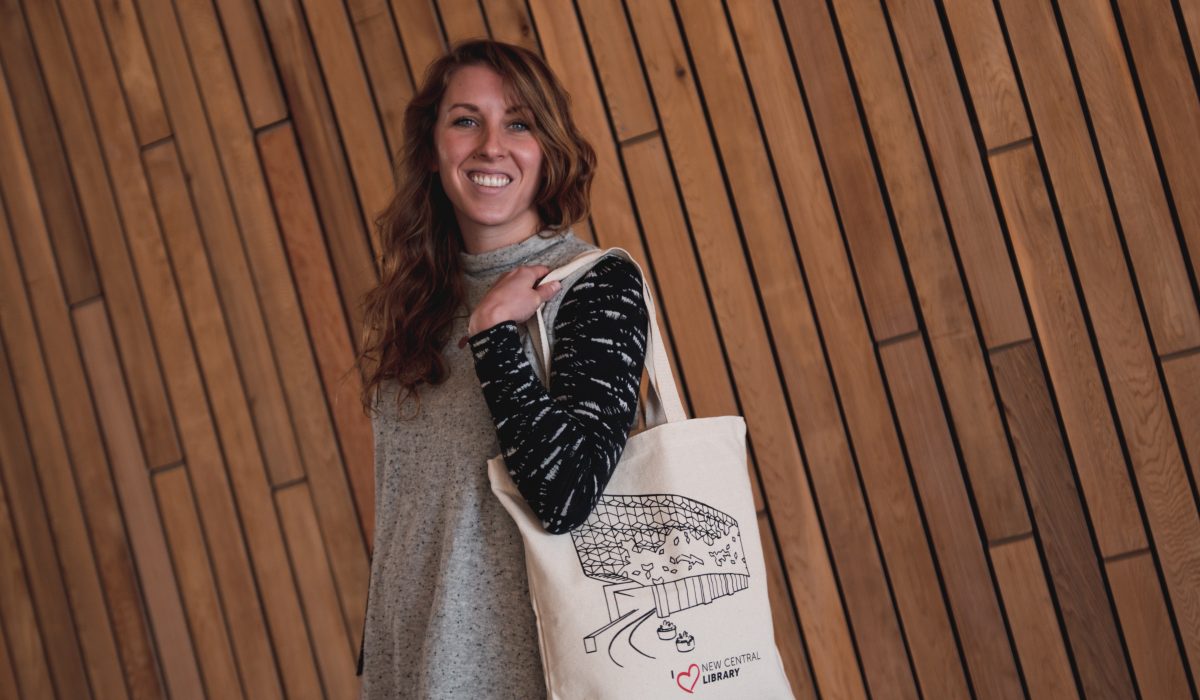
Location Illustrations
After creating collateral for a One Day Book Drive where I illustrated 4 Calgary Public Library Locations, the client was so thrilled they asked me to illustrate all 26 locations. I loved the challenge of this project as each location is strikingly different in Calgary, and each illustration had to be able to be displayed separately and together. The Library now has the ‘Love Your Library’ campaign where people can buy a tote to support their local branch. 📸: @RVLPH.G
Read More ›
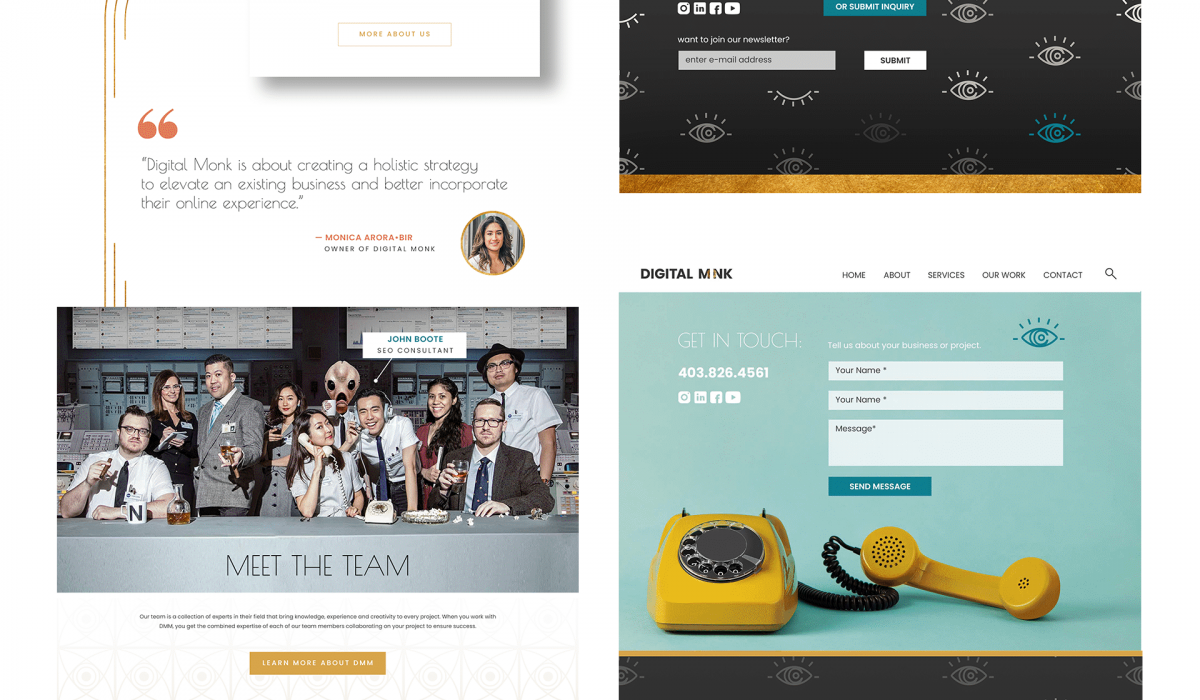
2021 Web Design
Several websites I have designed for Digital Monk Marketing in 2021. This includes: content creation for the site (infographics, icons, images etc.) creating web flats and adjustments based on client feedback working with a development team to implement the design maintaining the site – making any necessary edits/updates
Read More ›
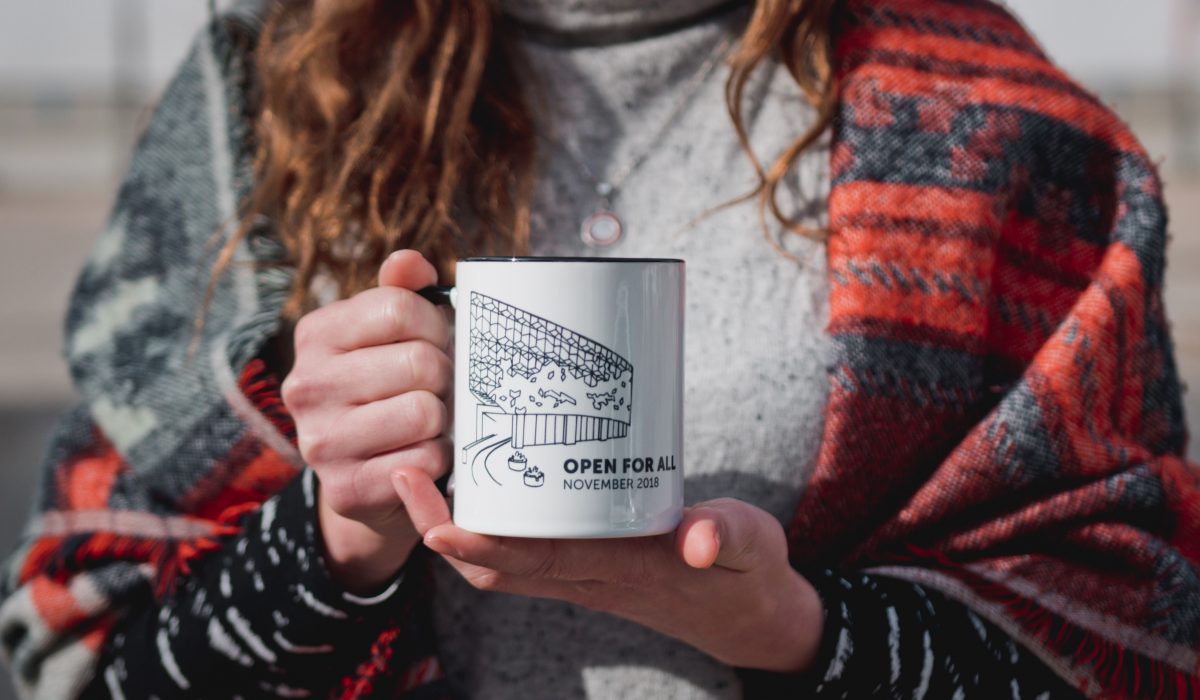
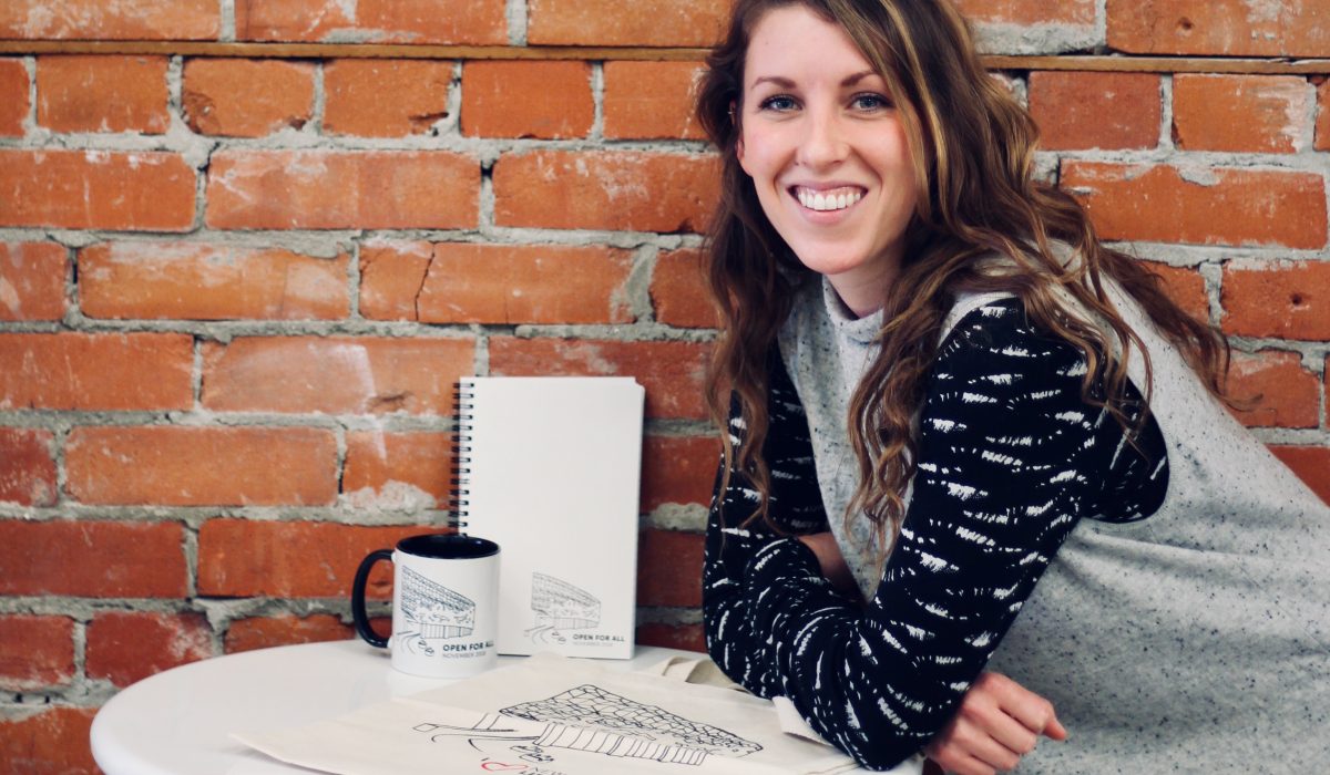
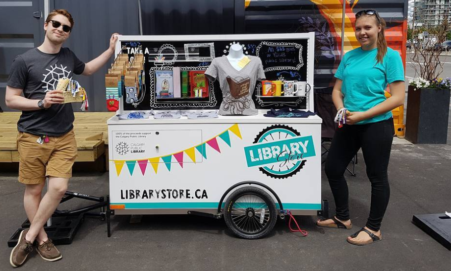
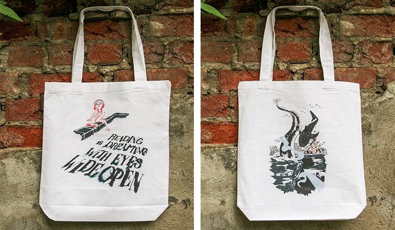
Library Store on Wheels
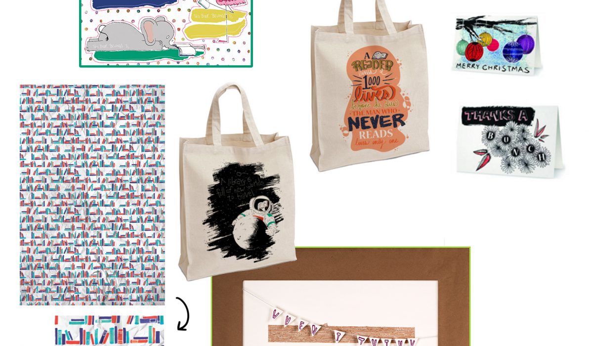
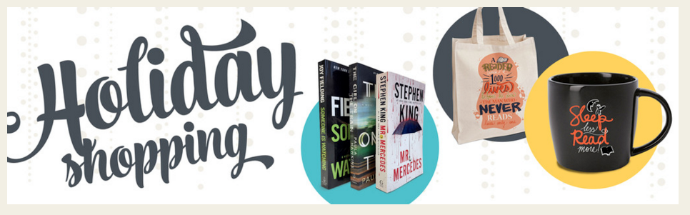
The Calgary Public Library Foundation came to me with a super exciting project this summer – Library Store on Wheels – an expansion of their online store. I got to design the logo and the vinyl wrap for a trailer they had made by a talented local carpenter. I had it produced on whiteboard vinyl so they can write messages, prices or sales and customize the store each time they open, as products would rotate depending on inventory and demand. In addition, I created several products for the Calgary Public Library Store, and sourced products from other local artists that bookworms would love! They had the standard swag with the logo on it covered, so we looked at what they were missing, and how we could make some products quirkier. My Product designs (clockwise): large mug (for lots of coffee) bookmarks greeting cards posters/prints tote bags wrapping paper “This book belongs to” stickers You can Shop for a Cause and get any of these items & much more at librarystore.ca or, seasonally, you can catch the mobile store and see what they have in stock!
Read More ›