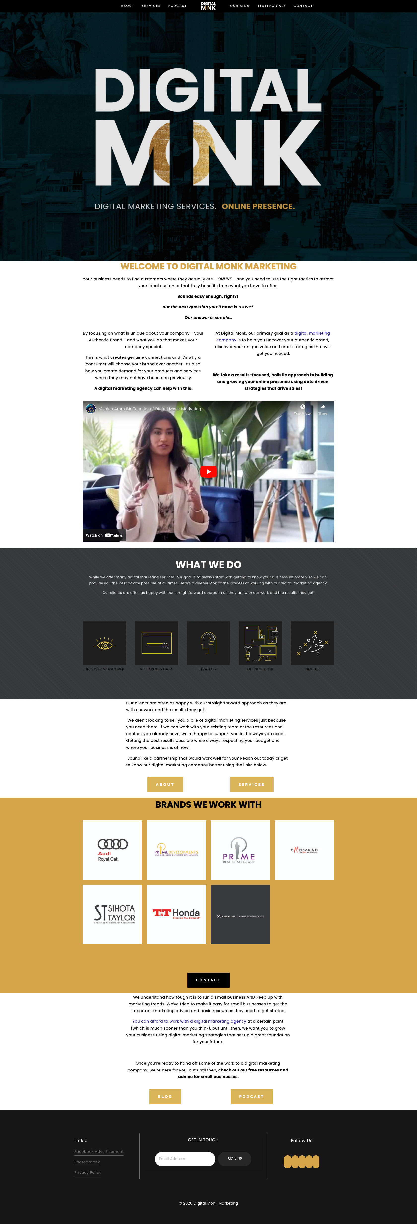

DMM was very happy with their existing logo, eye icon, planet imagery and color scheme, but the pieces did not connect and the brand message was getting lost.
We outlined what Digital Monk meant, and discussed the founder’s vision: innovative, evolving, modern, humble, and ethereal were some key words we identified.
This prompted me to take inspiration from the Art Deco movement, with it’s affinity for fine craftsmanship, and faith in technological pursuits I leaned into the use of gold, geometric forms, pattern, and nature. This gave the gold circle from within their logo purpose: Digital Monk looks at the whole picture, and puts the puzzle pieces together – we make our client’s brands whole.
The idea of being whole prompted a focus on circles within the iconography and photography. I added a secondary font with an art deco flare, and included more space imagery to emphasize DMM’s birds eye view.
This revamp included their website, stationary, newsletter template and social media content.
Creating meaning and cohesion behind each touchpoint has elevated the DMM brand immensely.
See below for their previous website.