Brand Expansion
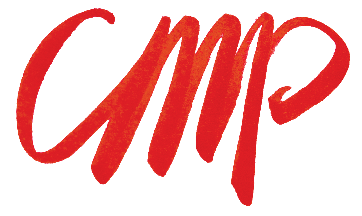
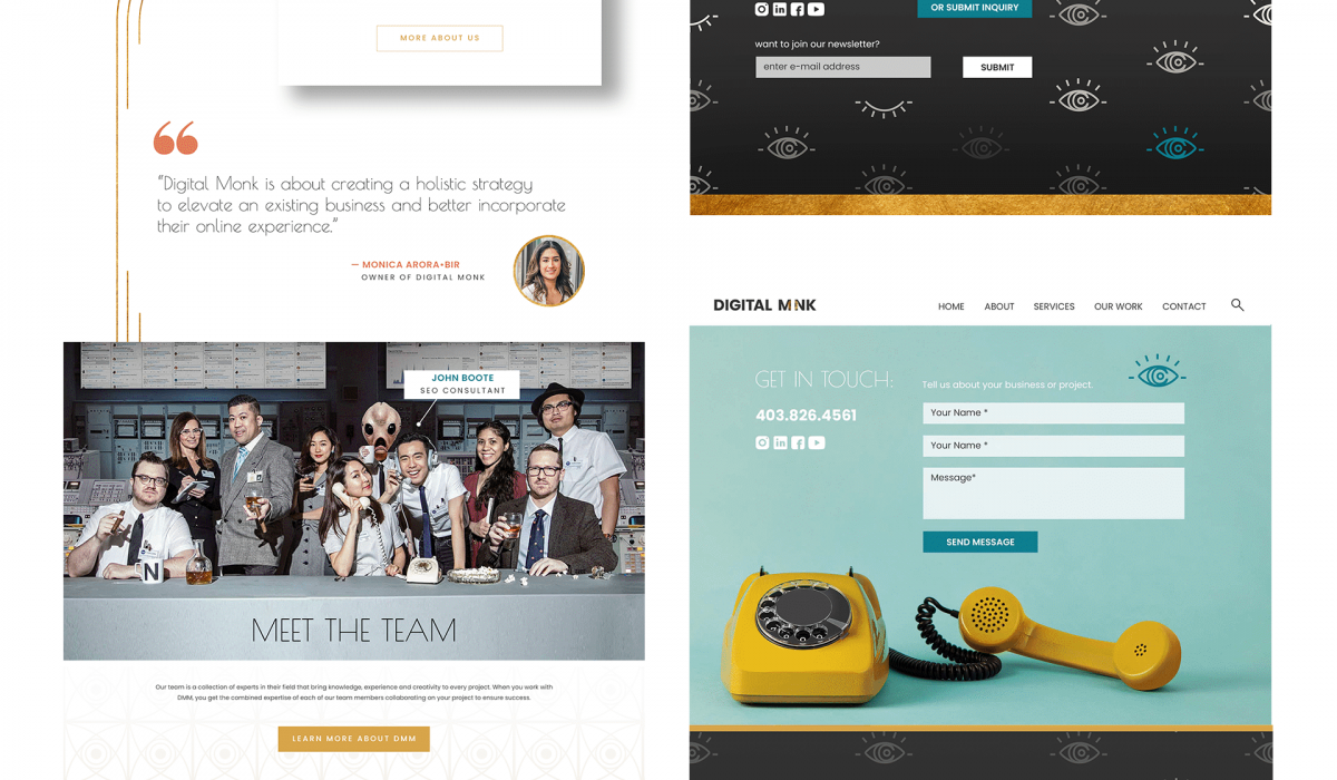
DMM was very happy with their existing logo, eye icon, planet imagery and color scheme, but the pieces did not connect and the brand message was getting lost. We outlined what Digital Monk meant, and discussed the founder’s vision: innovative, evolving, modern, humble, and ethereal were some key words we identified. This prompted me to take inspiration from the Art Deco movement, with it’s affinity for fine craftsmanship, and faith in technological pursuits I leaned into the use of gold, geometric forms, pattern, and nature. This gave the gold circle from within their logo purpose: Digital Monk looks at the whole picture, and puts the puzzle pieces together – we make our client’s brands whole. The idea of being whole prompted a focus on circles within the iconography and photography. I added a secondary font with an art deco flare, and included more space imagery to emphasize DMM’s birds eye view. This revamp included their website, stationary, newsletter template and social media content. Creating meaning and cohesion behind each touchpoint has elevated the DMM brand immensely. See below for their previous website. Alter Ego Archive Pink Archive
Read More ›
Brand Facelift
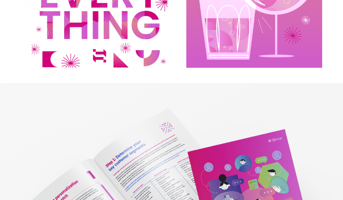
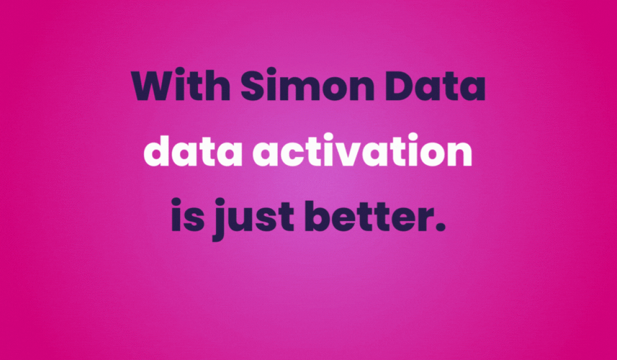
Simon Data has taken on a brand facelift, something to make their tech brand more playful, and personable. With the below homepage as reference I updated onesheets, social media assets, ebooks, presentation decks, illustrations, and icon sets to match the refreshed color scheme and logo. Info Design Design, Maker Location Illustrations Branding, Design, Illustration
Read More ›
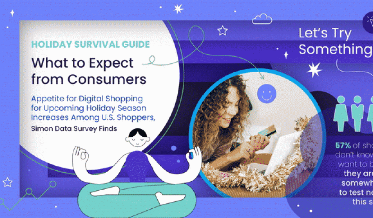
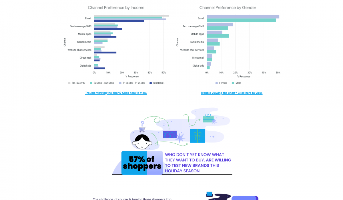
Infographic
This is an infographic created in support of a Holiday Hub landing page. The client and I thought it would be unique to do a horizontal scroll rather than vertical.
Read More ›
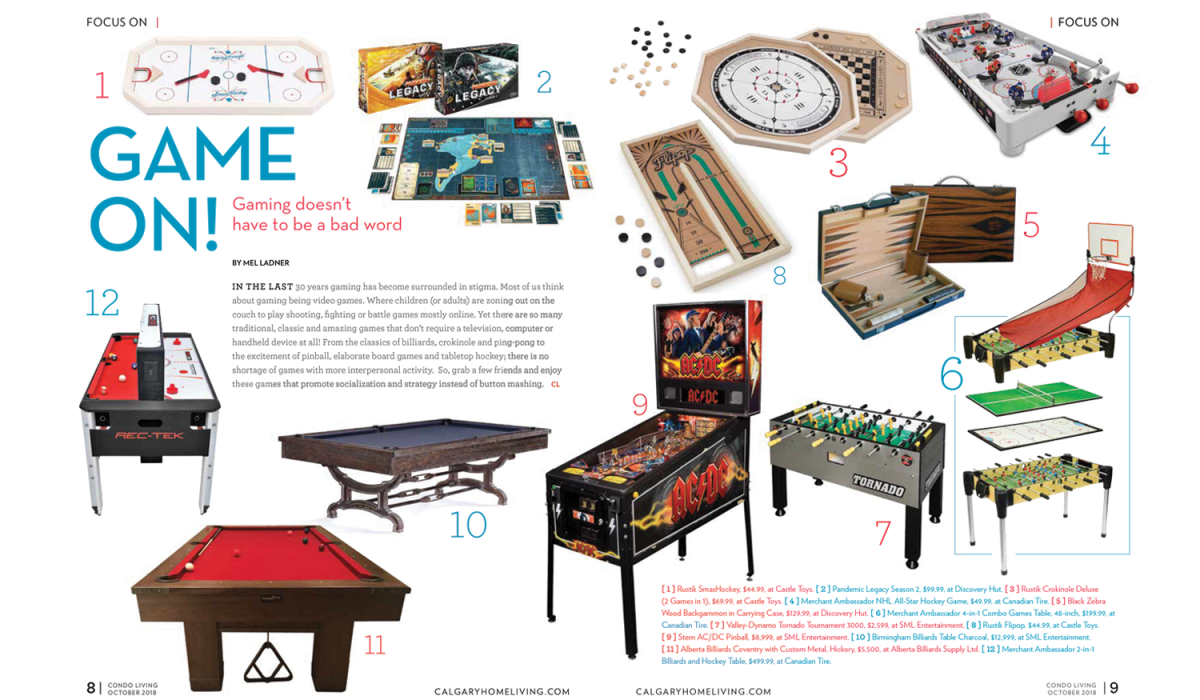
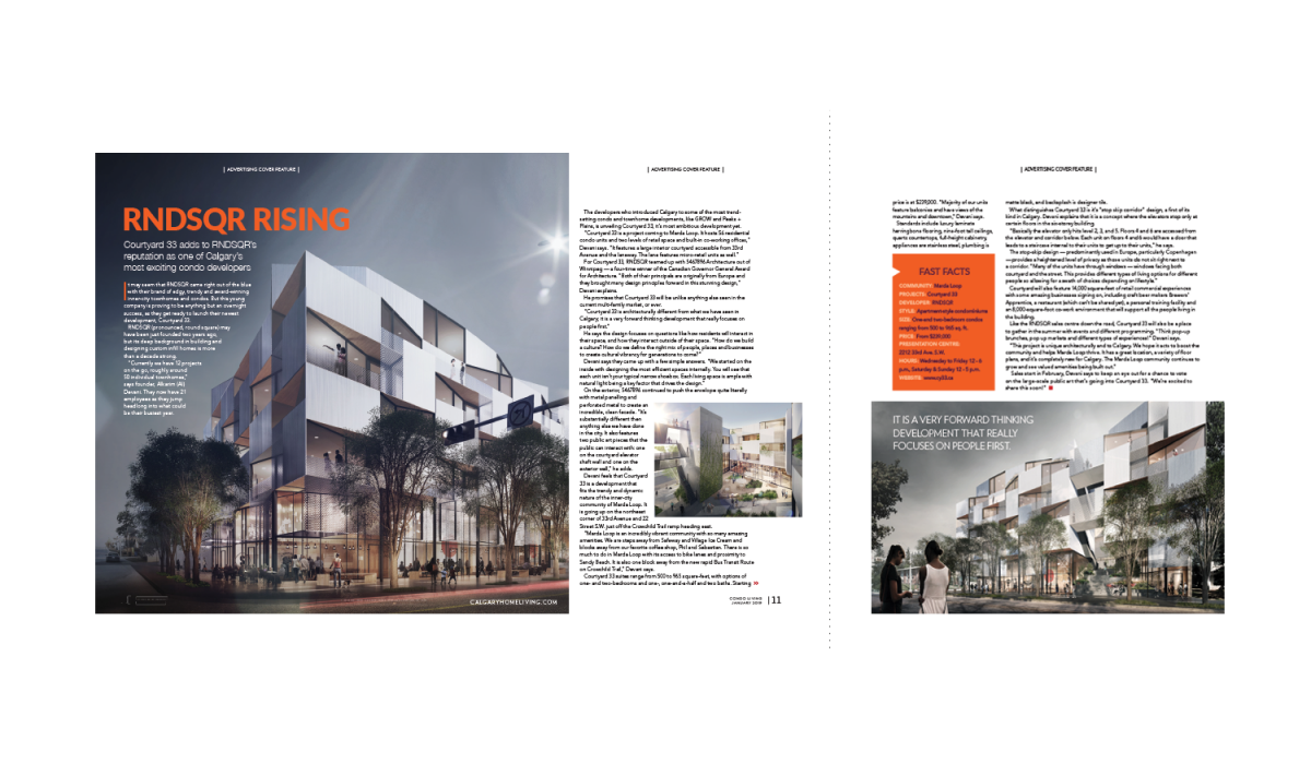
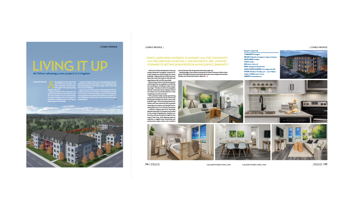
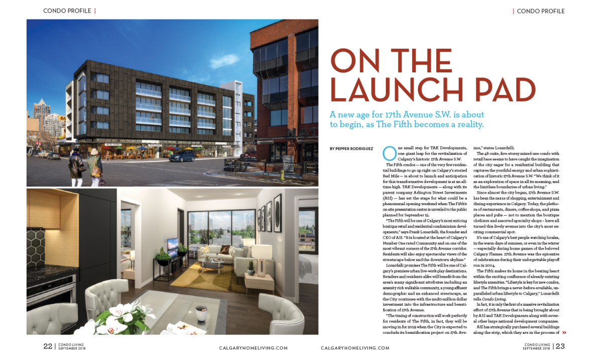
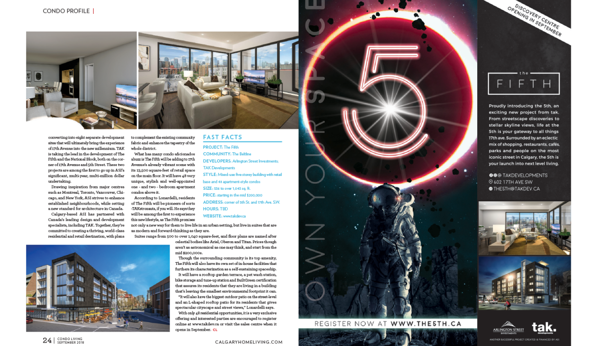
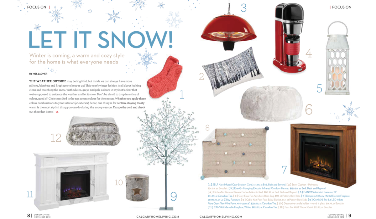
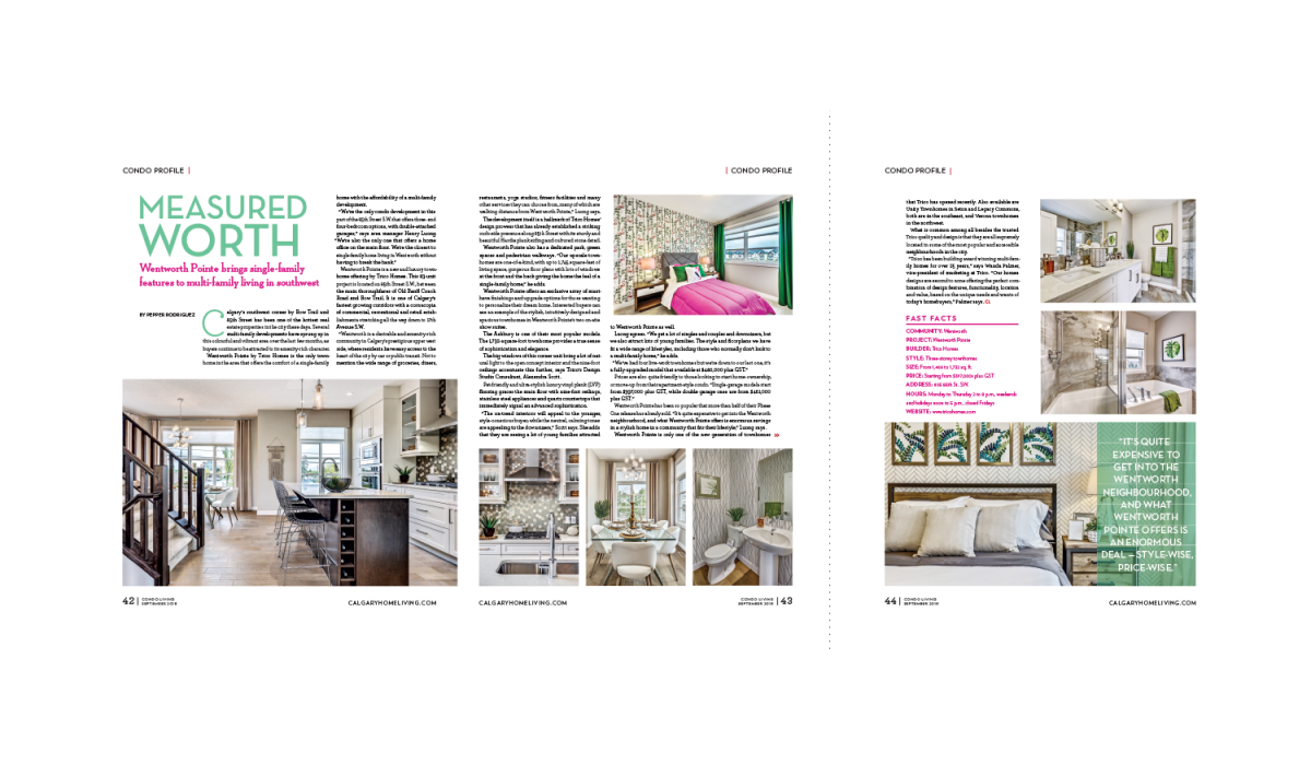
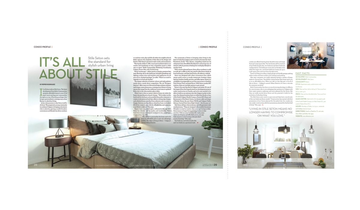
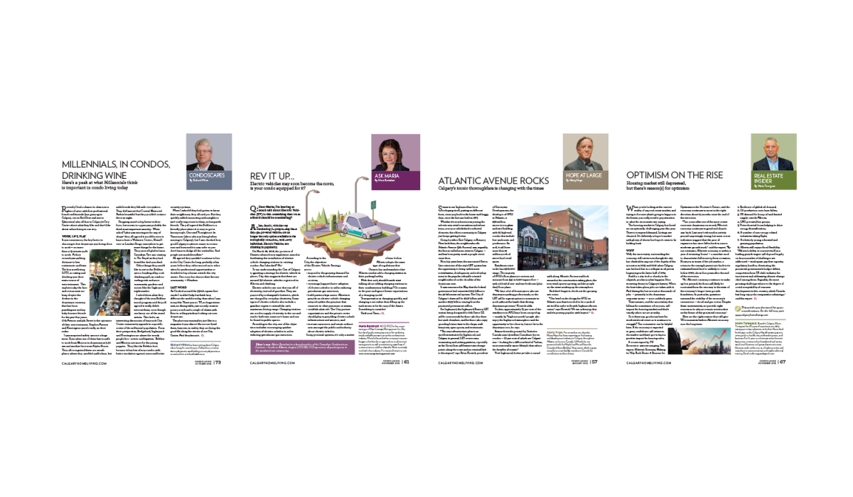
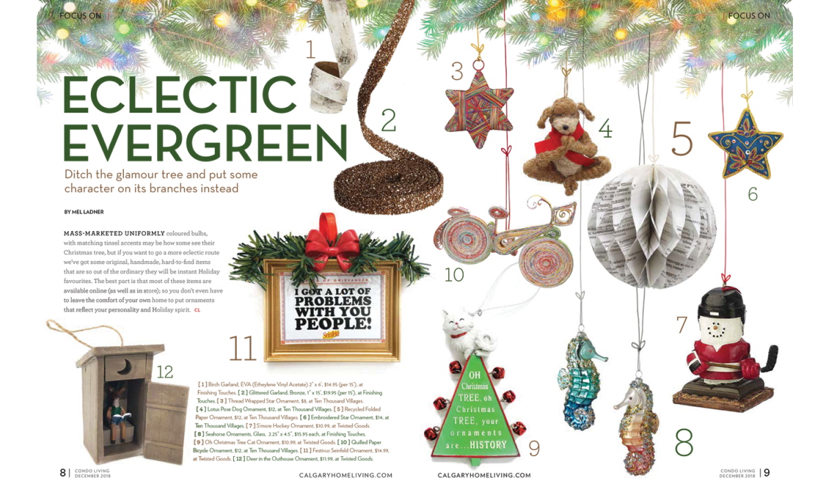
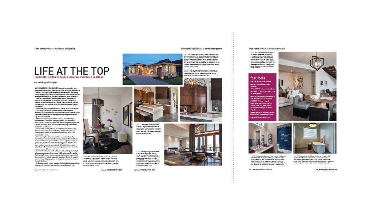
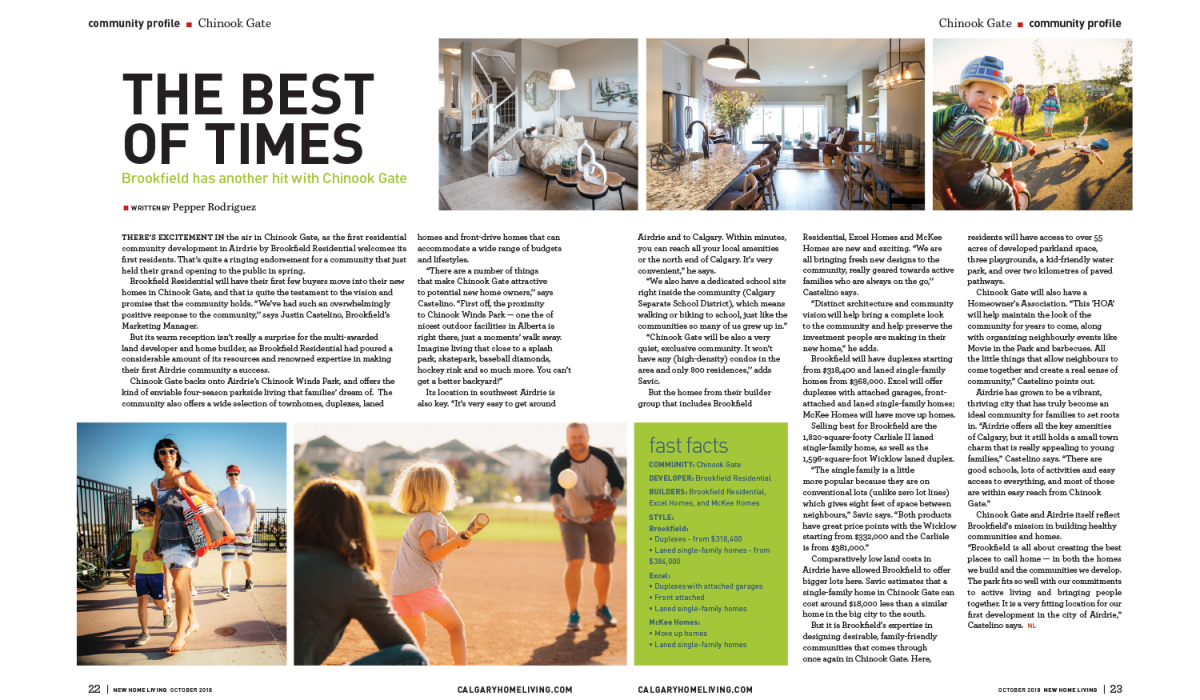
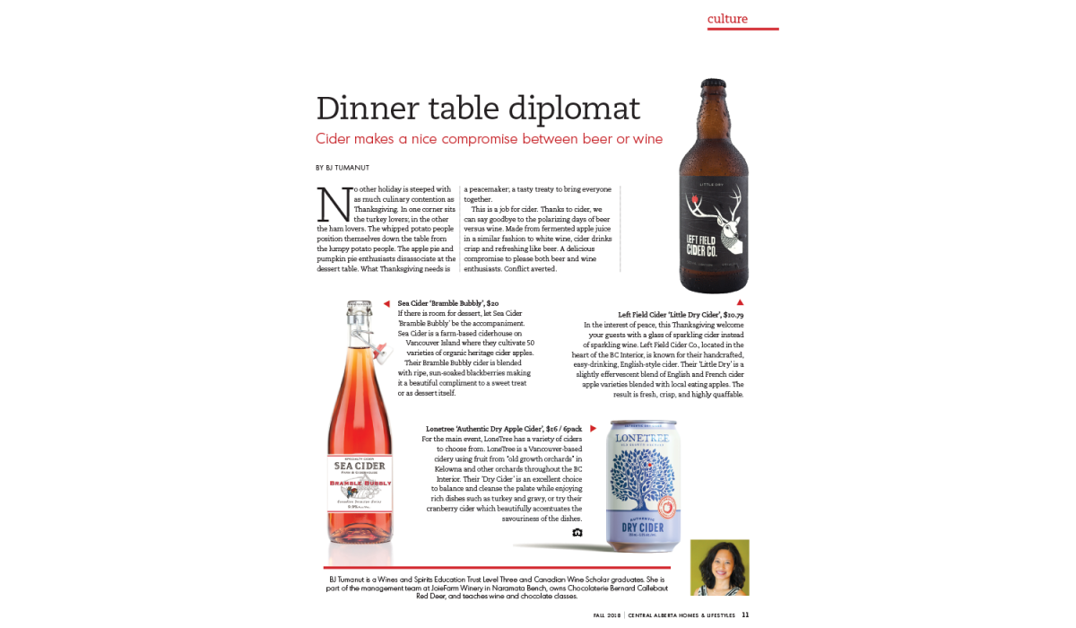
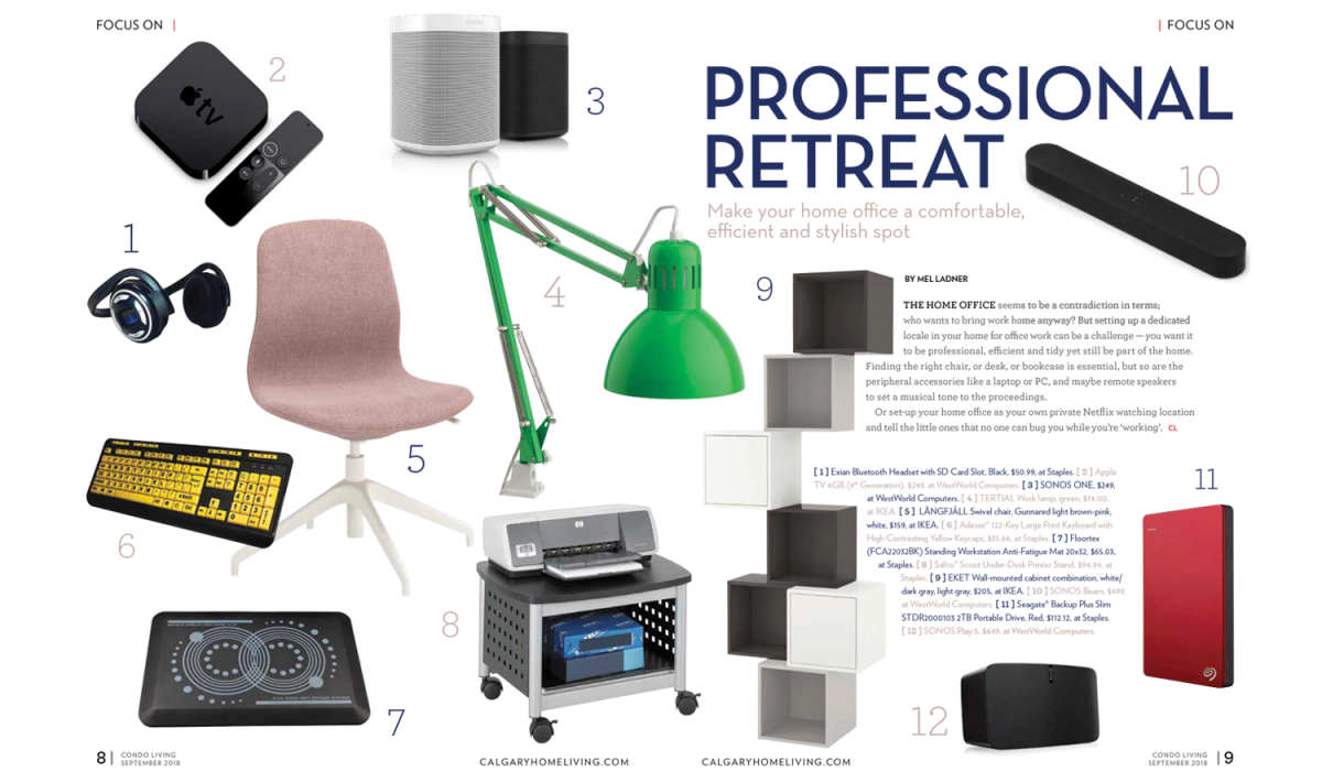
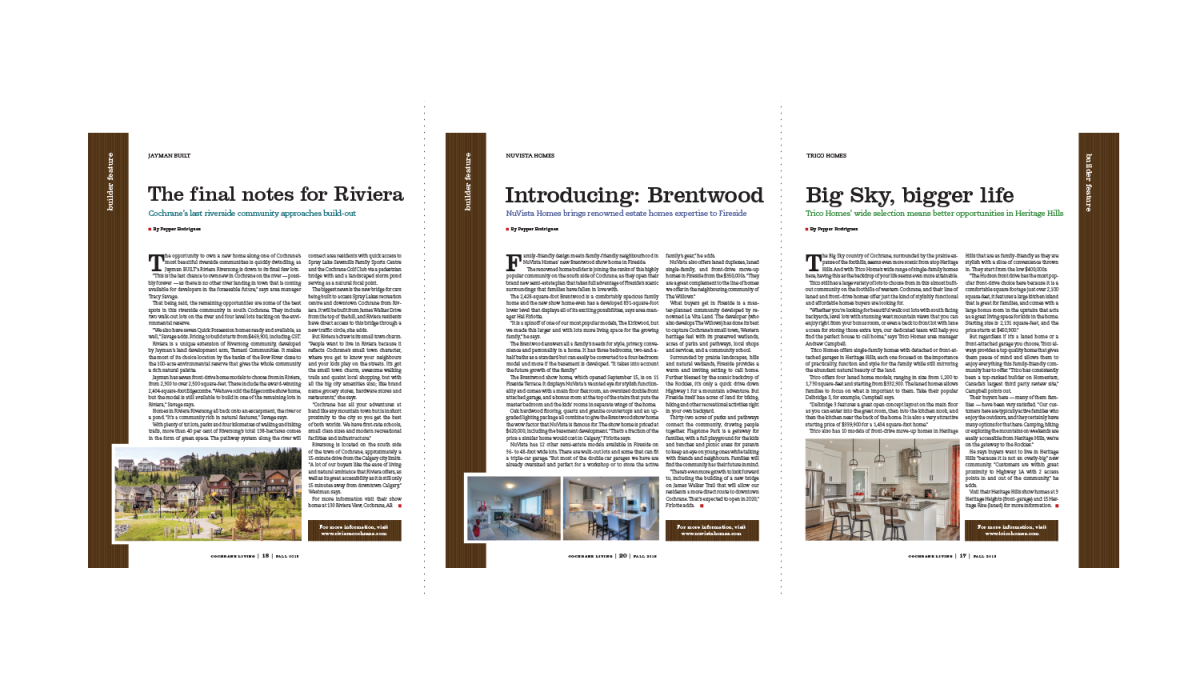
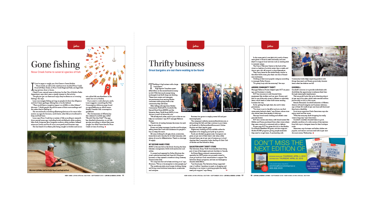
Editorial Design
These are a few of the spreads I designed from my time at Source Media Group. We produced 6 magazines in the Central Alberta area – 2 monthly and 4 quarterly. I updated several sites each month with the new articles and issues, and processed ads for our clients. calgaryhomeliving.com
Read More ›
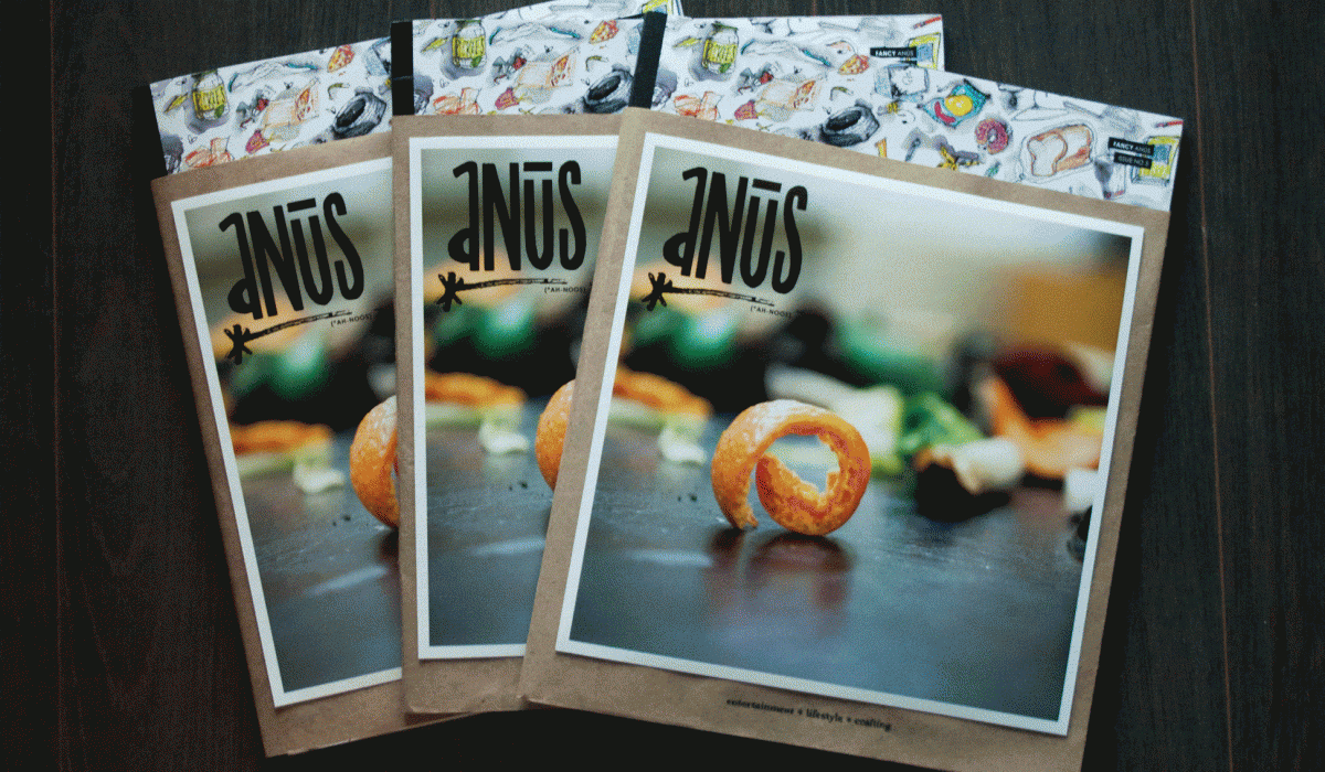
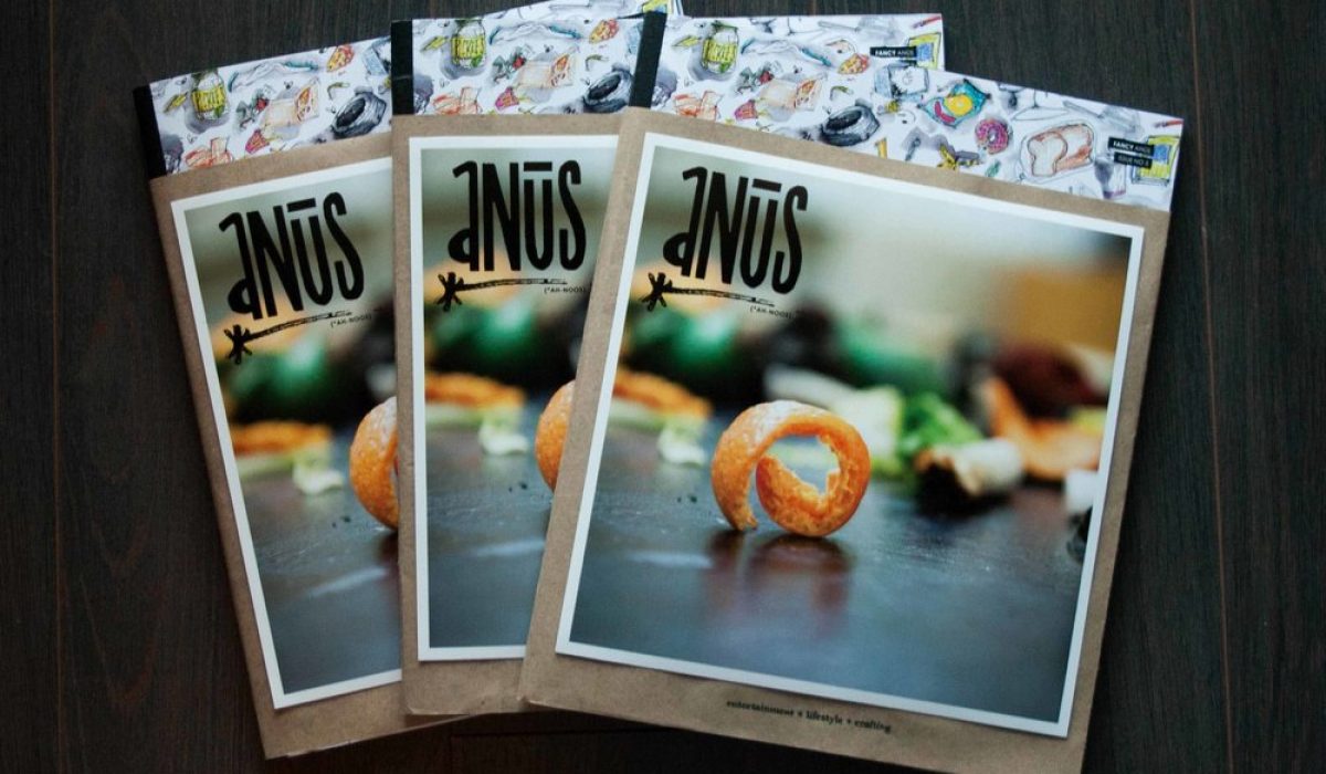
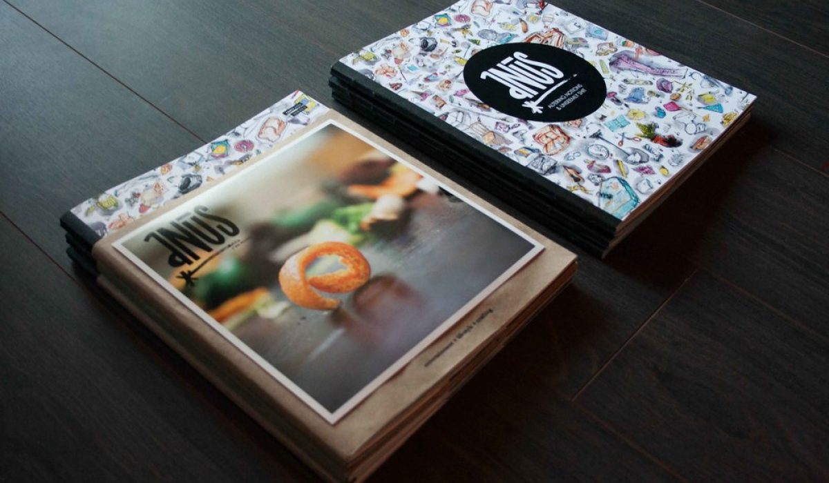
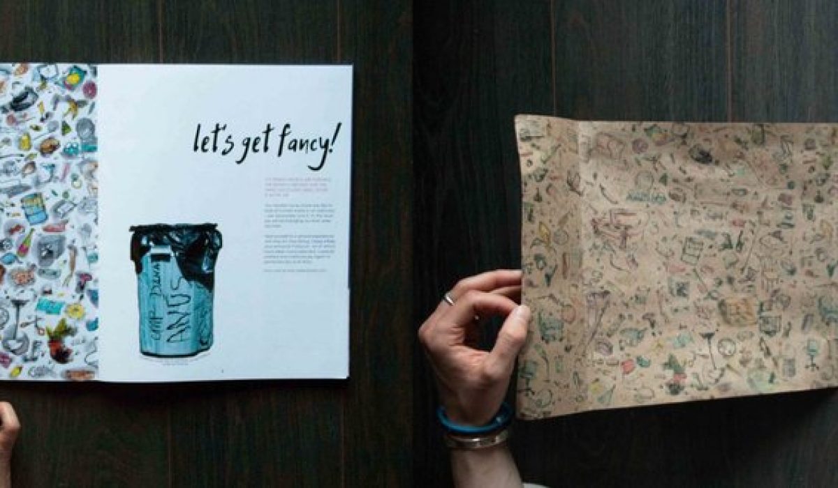
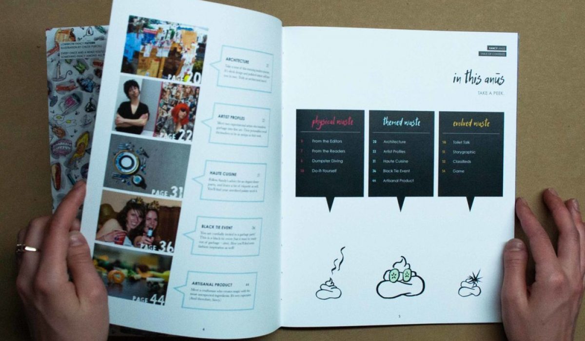
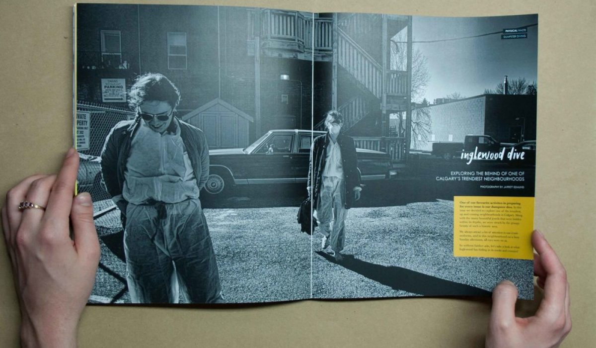
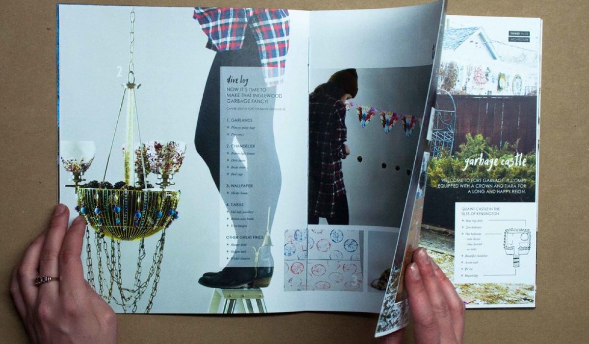
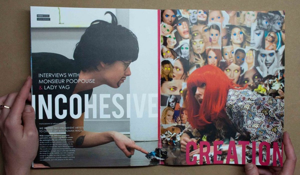
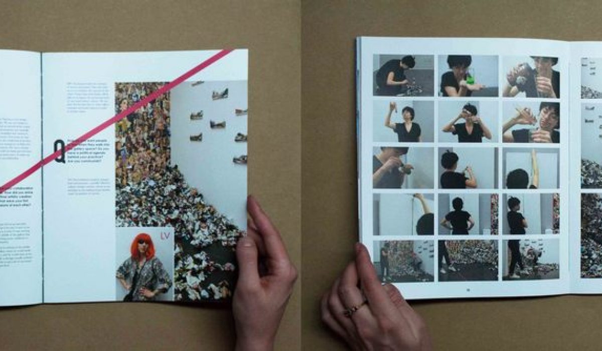
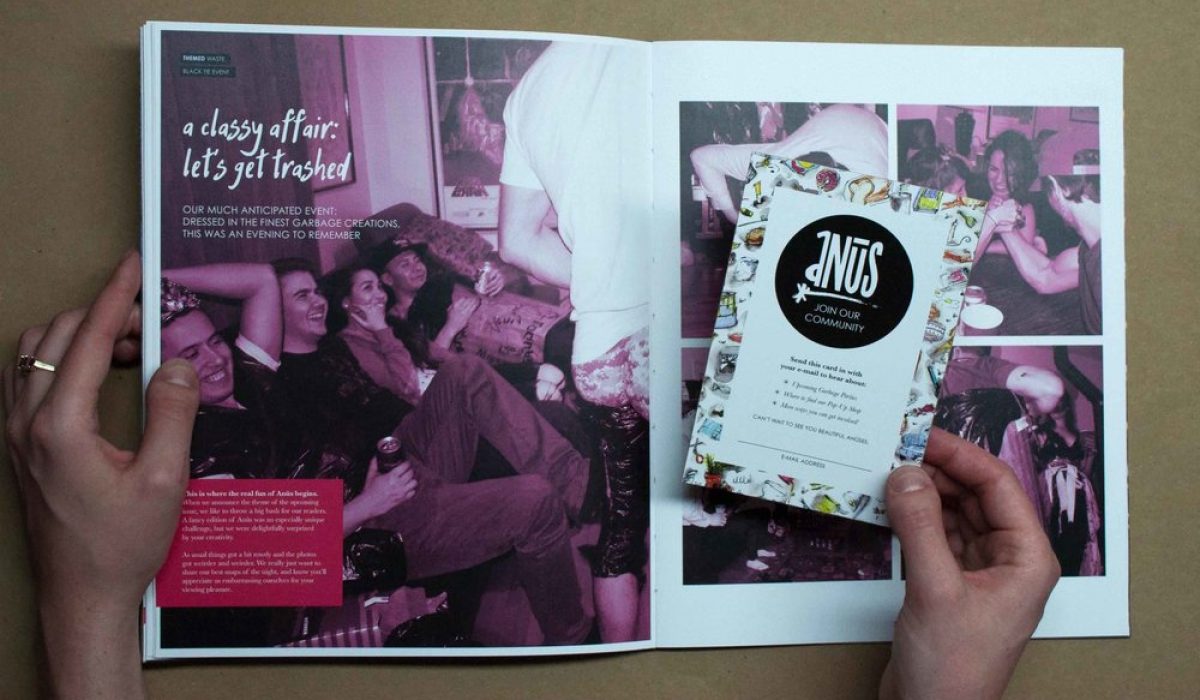
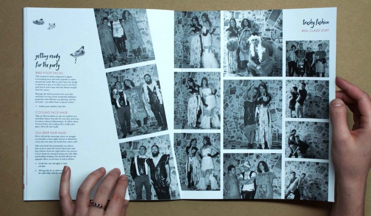
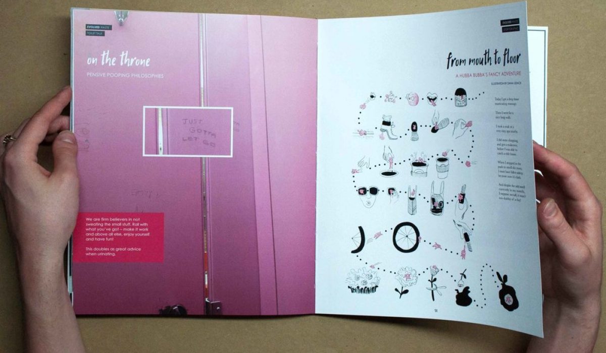
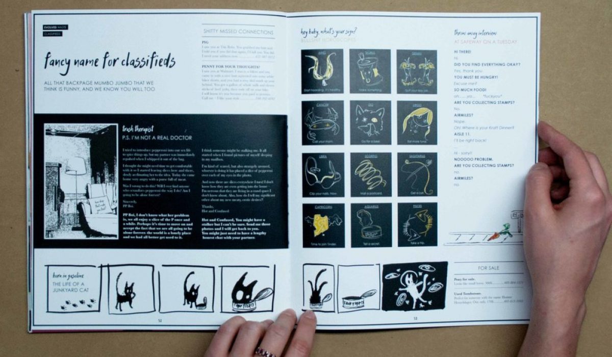
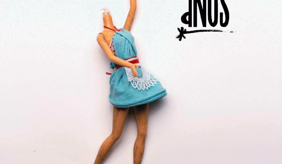
Anūs Magazine
(*ah-noos) Altering Notions and Unseemly Shit. This was a super fun magazine collaboration with Dana Lissack. We explored wasted opportunities by literally digging through the trash to suss out the chasm of possibilities that awaits. With a humorous and cheeky tone we provide entertainment, and creative inspiration to our readers. In this particular issue we venture to the otherside with our trash, where life is polished, and refined. Luxurious and provocative. Tasty and expensive. Anūs: Fancy edition
Read More ›
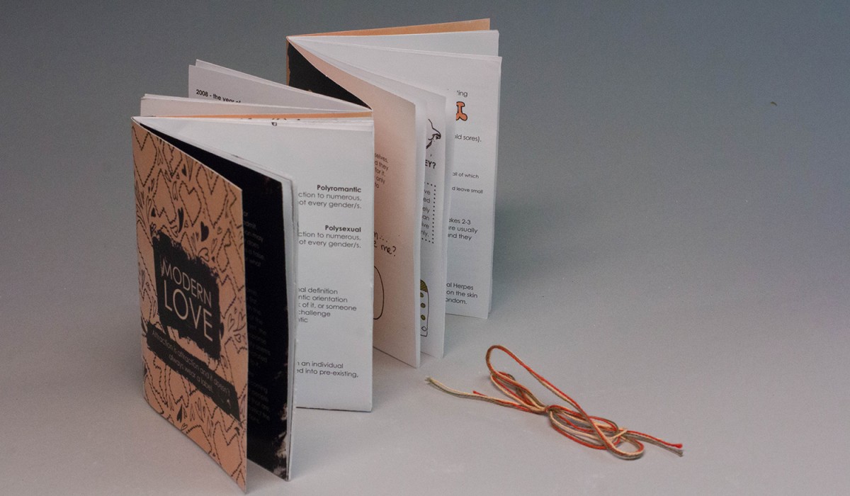
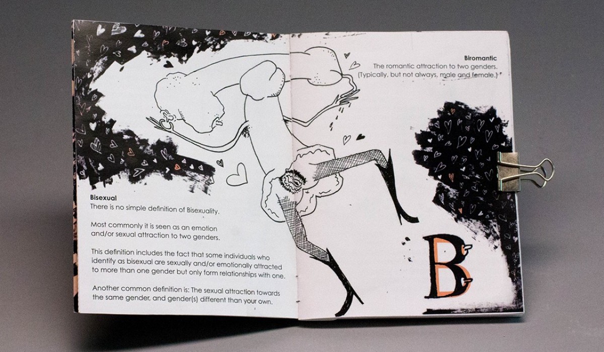
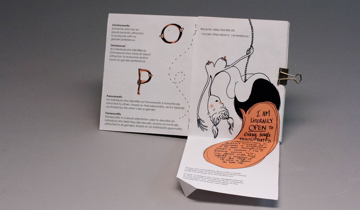
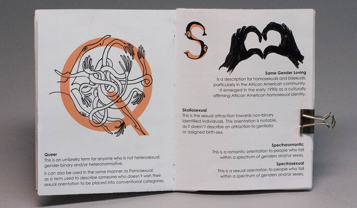
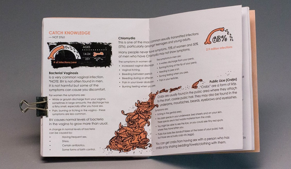
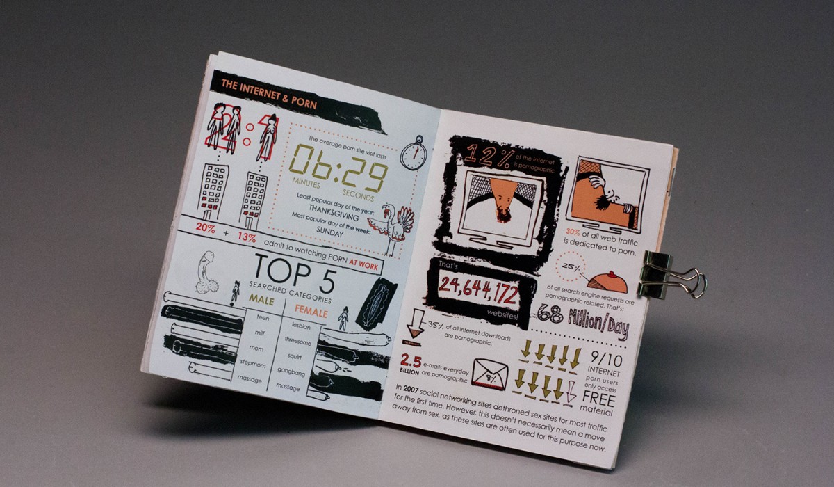
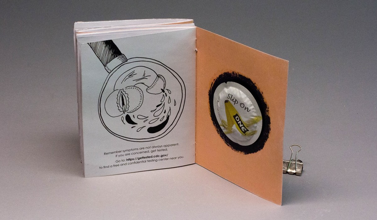
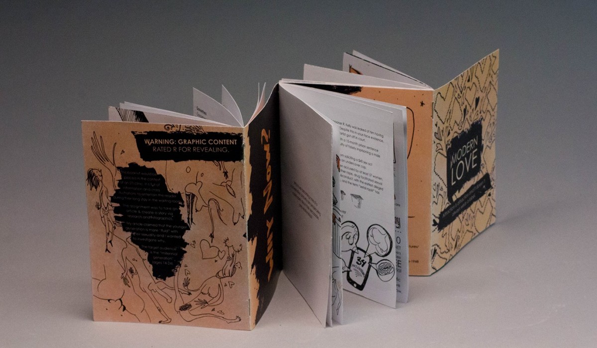
Sex Pamphlet
This is a pamphlet I created in Info Design. Intended for ages 14-24, it is meant to entertain the viewer during their long stay in a clinic waiting room with crass illustrations, open-minded information, and shocking statistics. The purpose is to realize that everyone is different, and there is no need to feel ashamed or judge anyone else. It’s time to be open, honest and safe. It is three booklets saddle-stitched in an accordion format for easy handling: Attraction Be Smart and Safe Why Now?
Read More ›
Visual Language
Creative Challenge: Create a new visual language for film advertising. One that relies on and relishes words, instead of falling back on the usual photographic imagery. Take a director of your choice and use the power of type to promote a retrospective screening of their films. Christopher Nolan often plays with time in his epic movies. This is why I chose to center my entire concept around one continuous thread to illustrate a timeline that interacted with motifs from the three movies. • Memento chronicles two separate stories of the main character, and the scenes are clues/hints to restore his memory. • Inception plays with time since as with each deeper level, time slows down. Ariadne, the architect in the movie is told to design mazes and her character is based off a woman in greek mythology that lead the hero of the story through a labyrinth using her rope. • Interestellar’s letters are strung up in the stars, and in this movie all the astronauts are affected by time due to a blackhole.
Read More ›
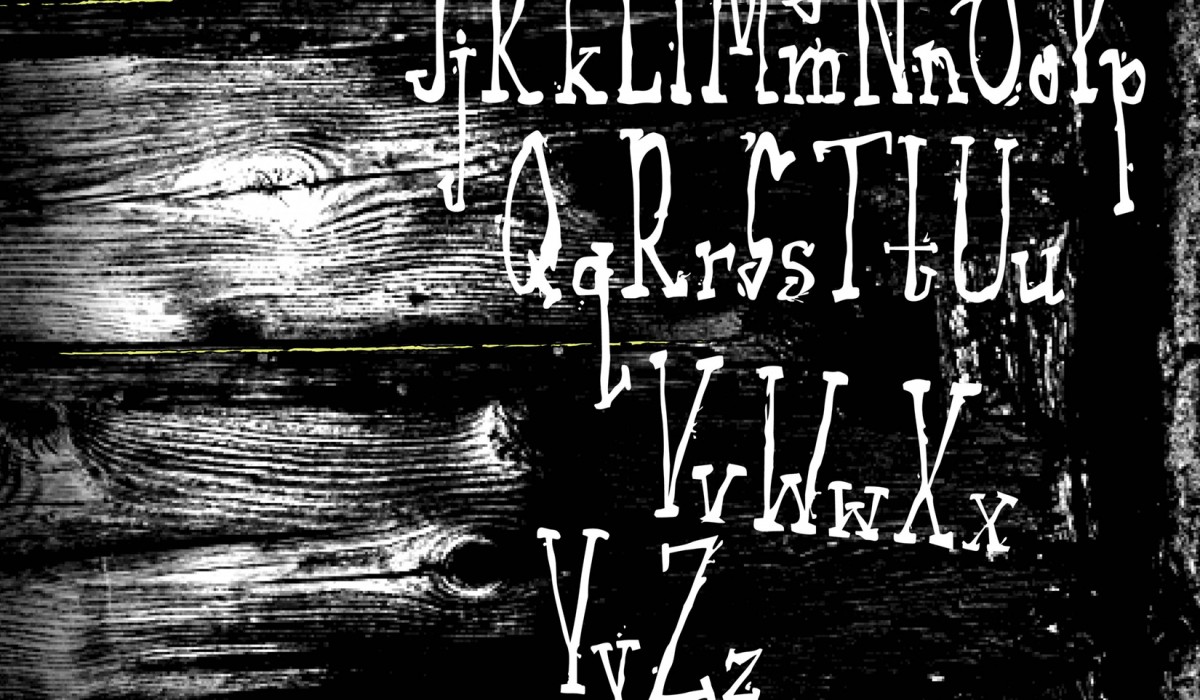
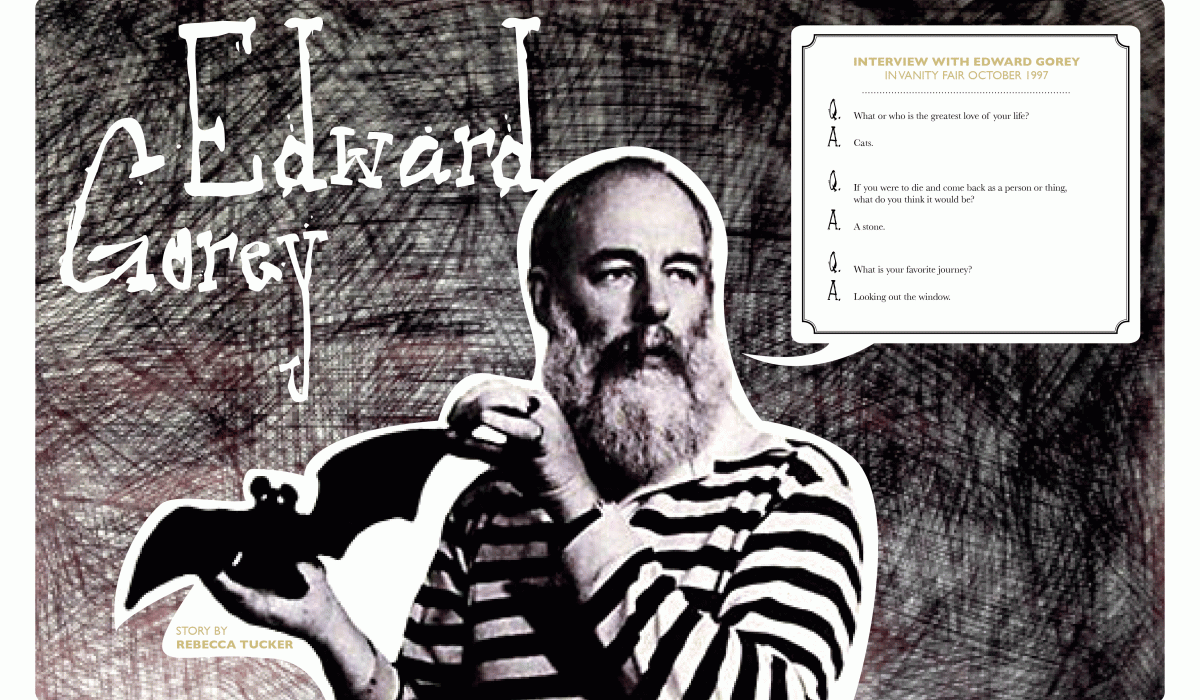
Font Design
Creaky Serif is a font I designed using a sprig of wheat, it’s light weight created some eerie splatter effects, so I ran with it. Here it is placed within the context of a magazine article about Edward Gorey.
Read More ›
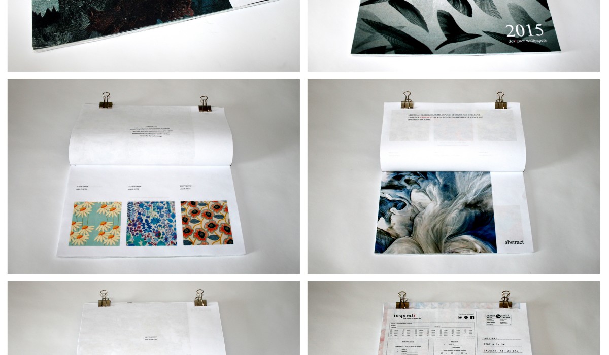
Lookbook
This is a simple lookbook design for a textile company. Loyal customers would receive it in the mail, and be able to see/feel the store’s collection from the comfort of their own home & with the tear out form they’d be able to order what they want without even having to go to the store. It would also be handy in the store where foot traffic could easily flip through the selection.
Read More ›